ReLoved
A trust-first, student-centered marketplace for second-hand furniture and appliances.
Furnishing an apartment as a college student is hard. We designed a marketplace that puts trust, transparency, and community at the center of the experience.
Designing a marketplace students can actually trust.
ReLoved is a mobile marketplace where verified college students buy and sell second-hand furniture and appliances — with live shopping, shared wishlists, and built-in trust signals.
Product
Mobile marketplace app
Problem
Students can't trust existing platforms
Audience
College students moving into apartments
My Role
End-to-end product design, UX research
Team
4 designers, cross-functional
Duration
3 months (Fall 2025)
Tools
Figma, Optimal Workshop, Miro
Study sample
8 interviews · 17 card sort · 8 tree test
Furnishing an apartment as a college student is hard.
It's a student's first major financial and logistical challenge — and existing platforms weren't built for how students actually shop, evaluate risk, or make collective decisions.
Budget pressure is real
Students are furnishing their first apartments on tight budgets. New furniture is often out of reach, and existing second-hand options feel like a gamble.
Trust is the biggest barrier
Platforms like Facebook Marketplace and Craigslist have no seller verification, no accountability, and no safety net — leaving students vulnerable to scams and no-shows.
Transparency is missing
Unclear photos, vague condition descriptions, and hidden pickup logistics mean students can't make informed decisions before committing their limited funds.
Coordination is painful
Roommates buying shared furniture need to align on decisions, budgets, and preferences — but no existing platform supports collaborative purchasing.

Key Insight
“Existing marketplaces were not designed around how students actually shop, evaluate risk, or make collective decisions.”
From understanding students to designing with intention.
Framing the challenge
Framing the challenge through the lens of student life and the realities of second-hand shopping.
Listening to students
Primary research with 8 participants to uncover unmet needs, behaviors, and pain points through interviews, affinity diagrams, and empathy mapping.
Translating insights into decisions
Translating research into a trust-first marketplace built around real student behaviors — not assumptions.
Iterating through testing
Iterating with 6 participants to reduce friction and sharpen clarity, letting feedback guide smarter design decisions.
Creating community
Building a marketplace — and a sense of community — around second-hand buying that feels trustworthy and human.
Students need trust before they need deals.
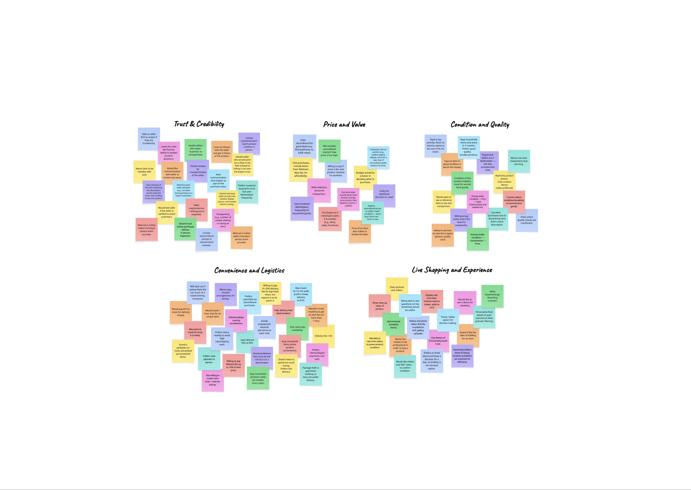
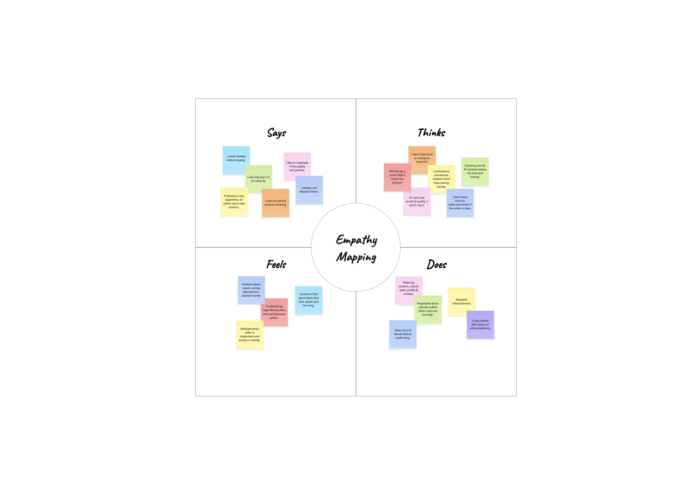
We used interviews, affinity mapping, card sorting, and tree testing to understand how students actually think about second-hand furniture.
Research Artifacts
Swipe through the boards that shaped the concept.
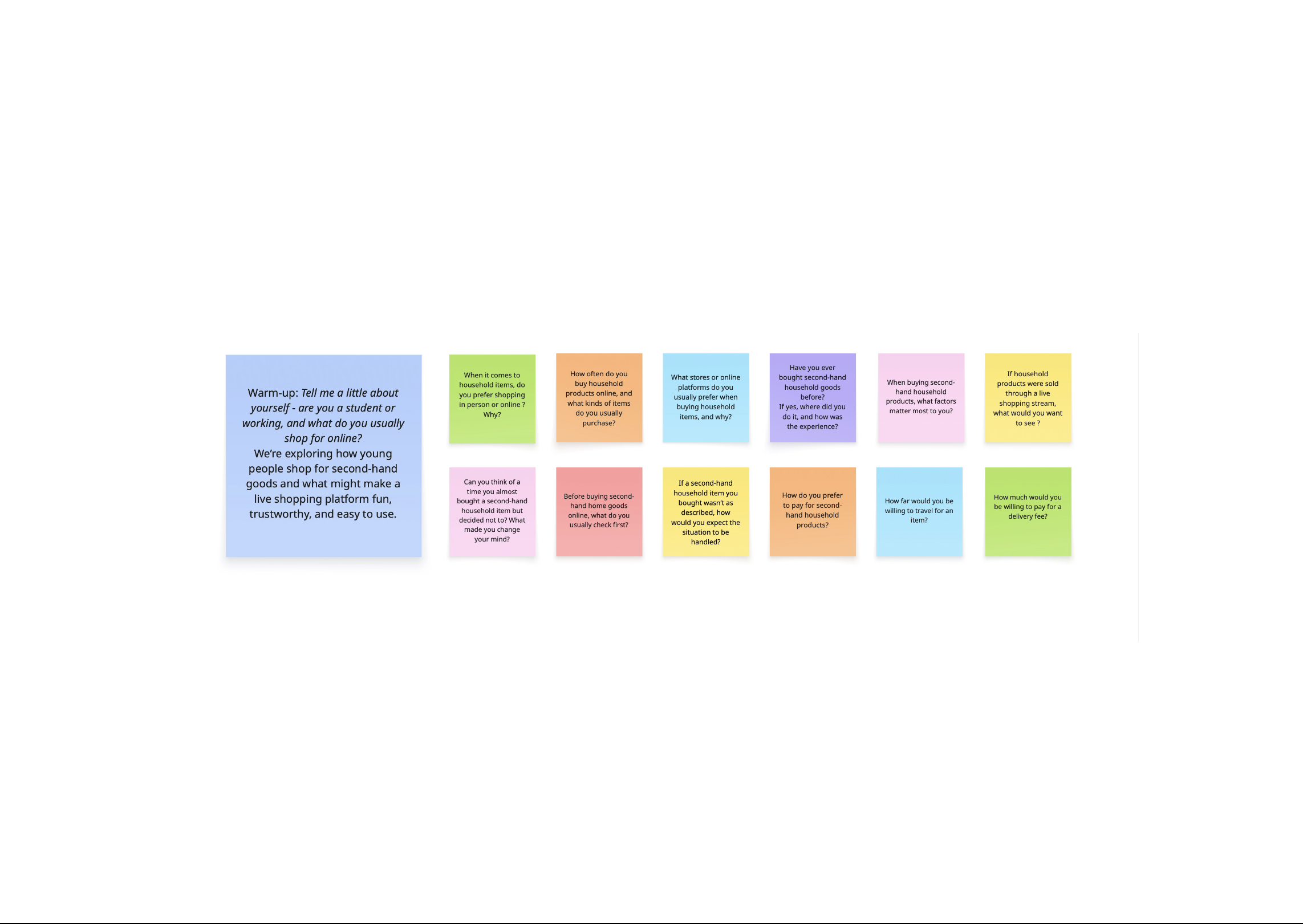
Interview Guide
Our interview prompts focused on trust, purchasing behavior, delivery friction, and live shopping expectations.
01 / 03
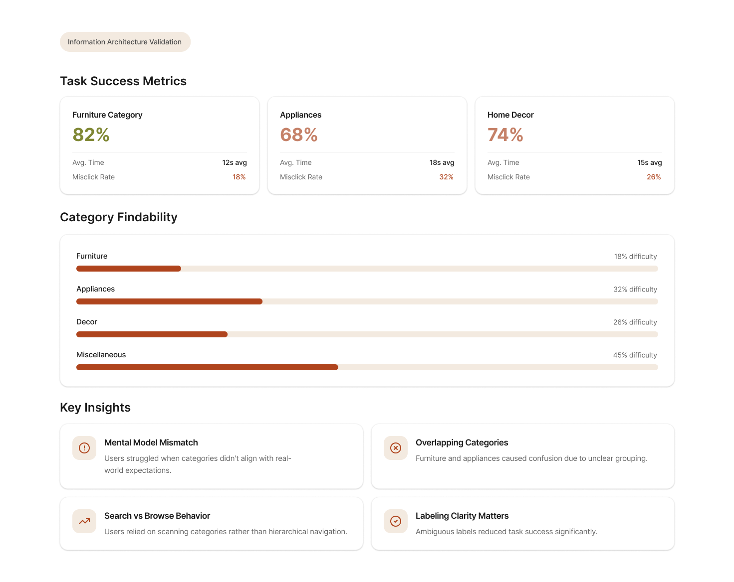
Card Sorting — Information Architecture
20%
Avg. tree test success
50%
Agreement on core navigation
10
Tasks across both studies
17
Participants
Open
Card sort method
13m 29s
Median completion
94–100%
Navigation consensus
Participants grouped core destinations consistently. Live Shopping was treated as a primary destination — elevated into main navigation as a result.
100%
Product detail grouping
Recency and condition rival price as decision-making signals. "Listed X days ago" and condition indicators were surfaced near price.
17/17
Live shopping is social
Real-time feedback reinforces trust and excitement. Chat, likes, and viewer count were prioritized over checkout actions during streams.
16/17
Location + price dominate
Local availability was nearly as important as price. Location filters were promoted to primary controls in the filter panel.
Key point
Trust and local relevance mattered more than endless choice.
Students were not asking for a larger marketplace. They wanted quicker trust cues, clearer category structure, and stronger signals that listings were recent, local, and worth acting on.
Tree Testing — Insights
What students really care about.
Six themes emerged from our research synthesis — each one challenged an assumption and pointed to a specific design direction.
Key point
Students will forgive a slightly higher price faster than they will forgive uncertainty.
The strongest pattern was not bargain-hunting. It was a need for trust, clarity, and low-effort local discovery that feels safe enough to use repeatedly.
Trust matters more than low prices alone
Students will pay slightly more for verified sellers. The barrier to purchase isn't price — it's fear of getting scammed or ghosted.
Design implication
Verification badges and seller history need to be visible everywhere a purchase decision happens.
Students prefer hyper-local discovery
Proximity drives decision-making almost as much as price. Students want to know they can pick something up today, not ship it from across the state.
Design implication
Location filters promoted to primary controls. Distance shown on every listing card.
Verification reduces anxiety
Knowing a seller is a verified student at a nearby school dramatically reduces perceived risk. It creates a shared identity that builds baseline trust.
Design implication
Student verification as a core platform mechanic, not an optional feature.
Live selling adds energy but needs clarity
Students are excited by live shopping — the social proof, real-time inspection, and chat interaction. But they need clear product details within the stream.
Design implication
Product cards overlaid on live streams. Chat and engagement signals prioritized alongside product info.
Condition and recency influence decisions
"How old is this listing?" and "what's the actual condition?" were the top two questions in interviews. Students distrust stale or vague listings.
Design implication
Listing age and condition rating surfaced at the card level, not buried in details.
Roommates shop together
Furnishing a shared apartment is a group decision. Students screenshot listings and share them in group chats — a fragmented, lossy workflow.
Design implication
Shared wishlists as a native feature, enabling collaborative decision-making inside the app.
How might we design a marketplace students can actually trust?
We translated our research insights into six design principles that guided every product decision.
Make trust visible
Implement seller verification and authentication checks. Surface trust signals — badges, reviews, listing history — wherever purchase decisions happen.
Prioritize local relevance
Strong filtering by location, price, and condition. Make discovery fast and geographically relevant — students want to pick things up today.
Simplify discovery
Clean browsing with curated categories, intuitive search, and smart filters. Reduce the cognitive load of sifting through cluttered listings.
Support collaborative shopping
Shared wishlists for roommates, seamless in-app sharing, and collaborative decision-making tools to match how students actually furnish apartments.
Make live commerce useful, not gimmicky
Live shopping should feel like inspecting an item in person — with real-time chat, product details overlaid on streams, and authentic seller interaction.
Foster community
Create a space that encourages connection and belonging among students. Avoid bidding wars and competitive dynamics — this is a campus community, not an auction house.
What we got wrong — and how testing changed our direction.
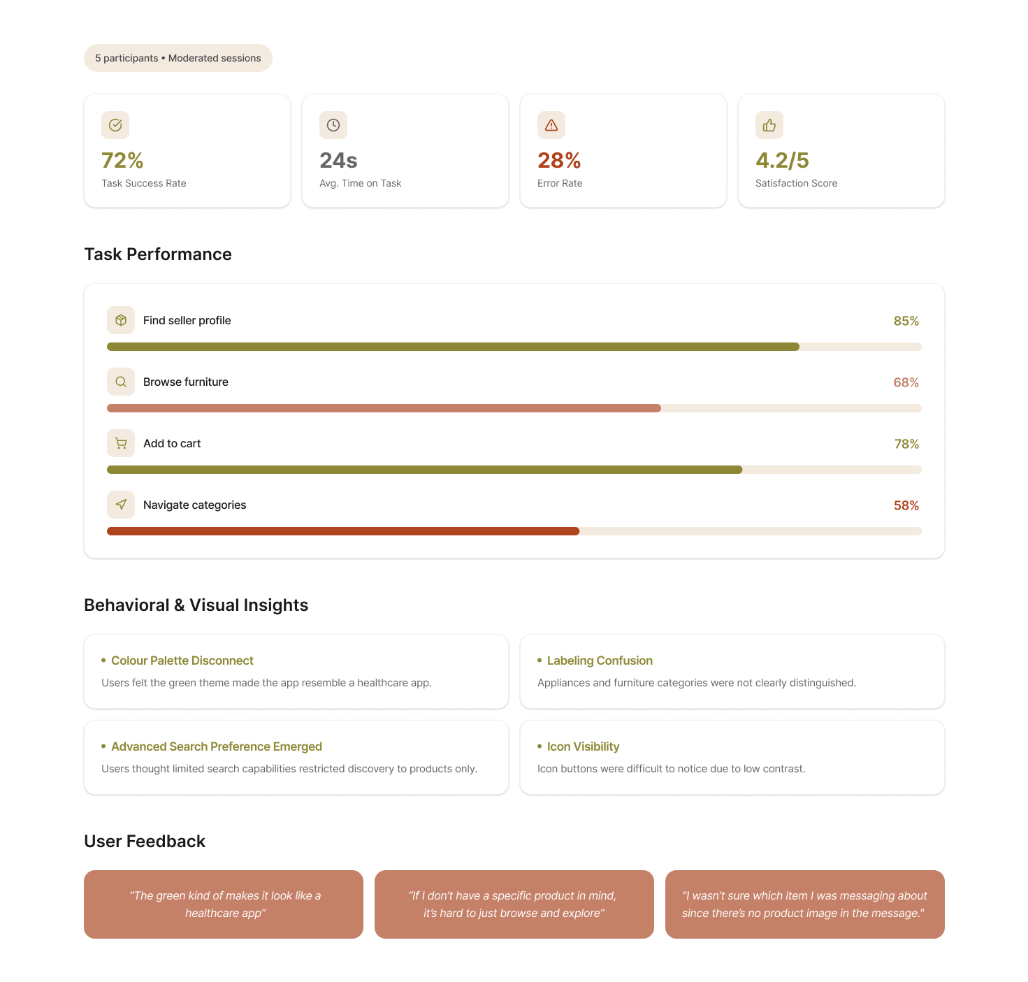
Our first iteration looked polished on screen but missed the mark on feel. Usability testing with 6 participants revealed critical issues we hadn't anticipated.
Wrong color palette
Our initial green palette was associated with healthcare by participants. It created unintended formality in what should feel warm and approachable.
What changed
Switched to a warmer, more human palette — terracotta, soft beige, and muted tones that feel like home.
Confusing information architecture
Labels like "Profile," "Listing," and "Product Details" overlapped in meaning. Users made confident but incorrect navigation choices.
What changed
Restructured IA around user mental models discovered in tree testing. Renamed and reorganized core sections.
Weak trust communication
Verification badges were present but not prominent enough. Users didn't notice them during tasks and still expressed anxiety about seller legitimacy.
What changed
Made verification visible at every touchpoint — on cards, profiles, product detail pages, and live streams.
Color palette evolution
Users associated the initial green palette with healthcare, which created an unintended sense of formality & distance.
Teal Green
#018C42
Aqua Green
#01B6A5
Lavender Pink
#EEB3E7
Soft Ivory
#EFECE7
We refined the color system to introduce warmth without overwhelming the interface, helping the product feel more approachable.
Terracotta
#AF441D
Olive Gold
#8D8835
Warm Clay
#C5B1A8
Soft Beige
#F5EAE0
Soft Camel
#D9C094
Users associated the initial green palette with healthcare and formal institutions. The warmer palette scored significantly higher on ‘approachability’ and ‘trustworthiness’ in our follow-up testing.
Navigation structure
Swipe Through Screens
01 / 04
Original IA screen 1
Swipe Through Screens
01 / 02
Revised IA 1
Tree testing revealed 0% success on critical tasks. The redesigned navigation used language and groupings that matched how students actually think about marketplace actions.

ReLoved Atmosphere
Designed to feel less like a marketplace and more like the start of a home.
Presenting ReLoved.
A trust-first, student-centered second-hand marketplace. Built on research, shaped by real students, designed to feel like community.
Final takeaway
The product works when trust feels immediate, local, and low effort.
Every major design decision, from the IA to the listing cards to live shopping, reinforces that one promise.
Built around how students actually shop.
Every feature connects back to a research insight. Here's what ReLoved looks like in practice.
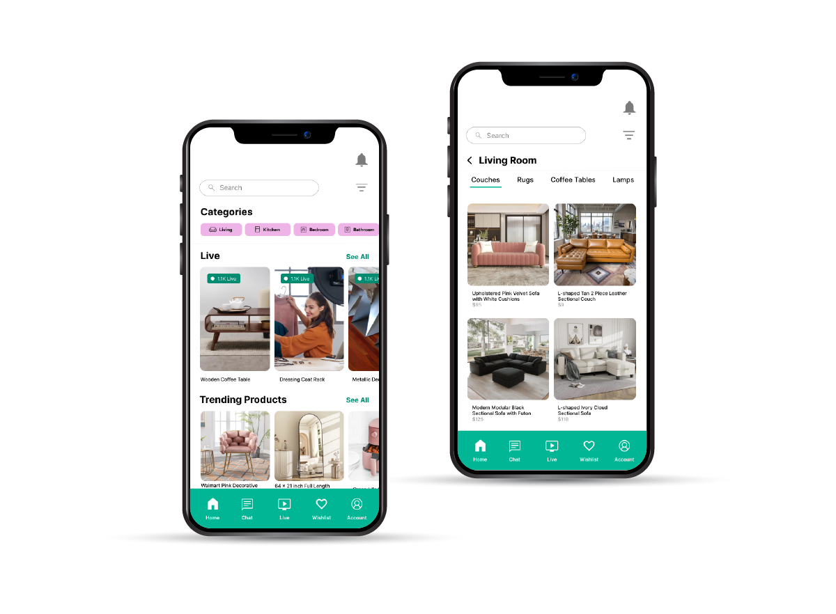
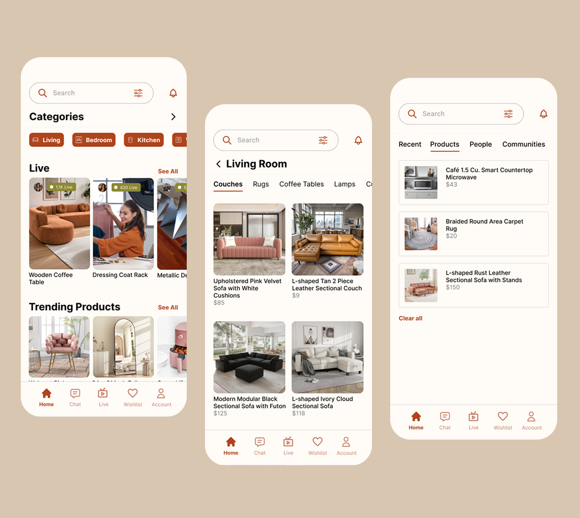
Home & Category Browsing
A clean, curated browsing experience organized around how students actually search — by category, recency, and proximity. Subcategories allow focused exploration without overwhelming the user.
Design note
Category structure was validated through card sorting with 17 participants. 94–100% consensus on core groupings.
Advanced Filters
Filter by locality, price range, condition, listing date, free items, back-to-school sales, and rentals. Location and price are promoted to primary filter controls based on card sorting data.
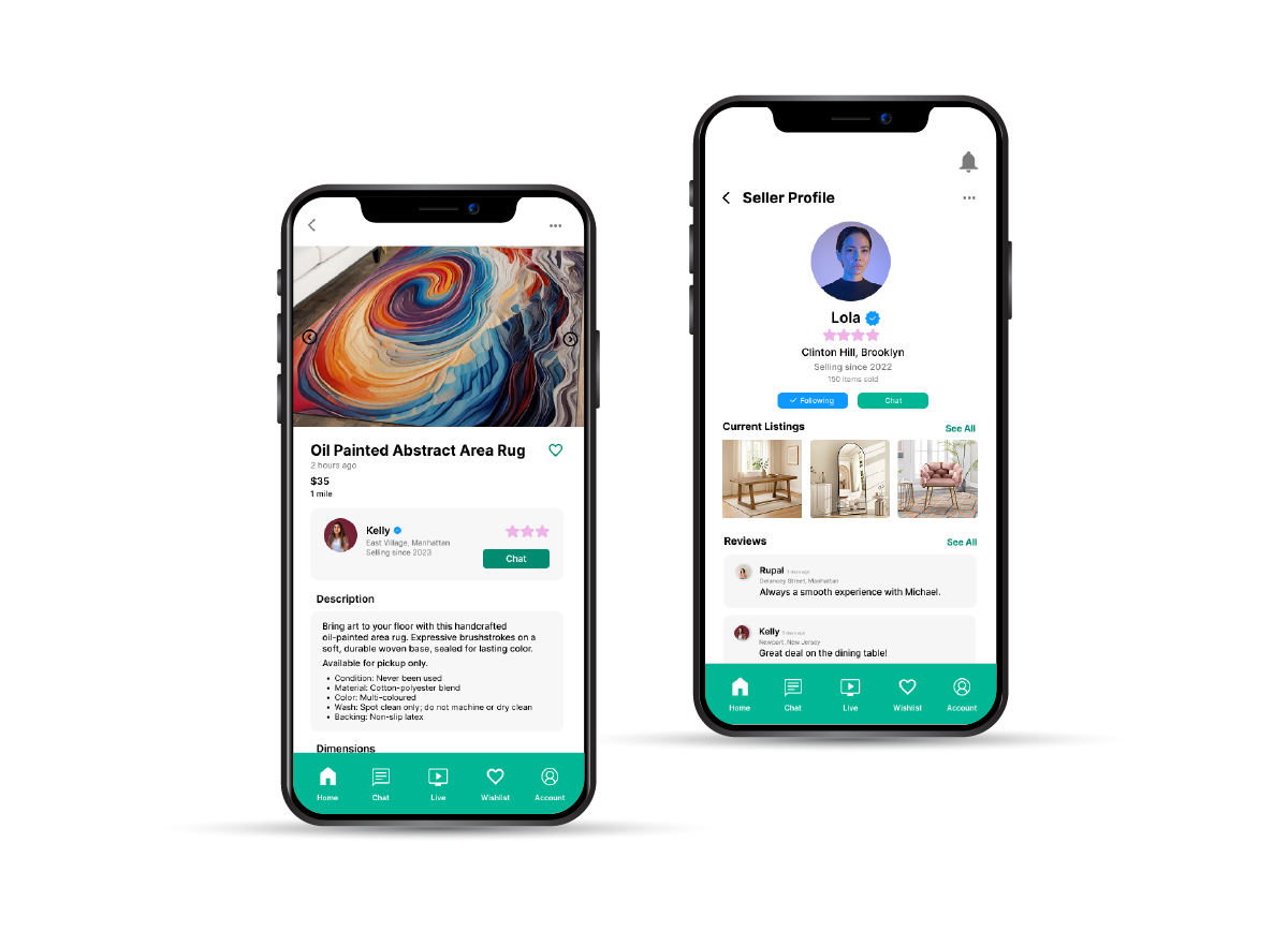
Product Detail with Trust Signals
Every product page surfaces the information students need most: condition rating, listing age, seller verification status, and review history. No more guessing whether a listing is stale or a seller is trustworthy.
Design note
Condition and recency were surfaced at the card level — not buried in details — based on interview feedback.
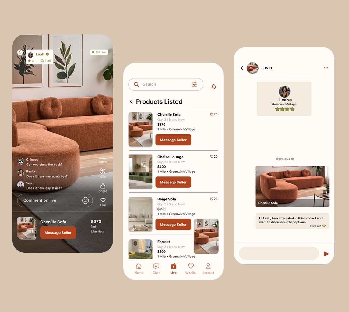
Seller Profile
Transparent seller profiles with verification badges, listing history, review scores, and response time. Buyers can assess seller reliability before initiating any conversation.
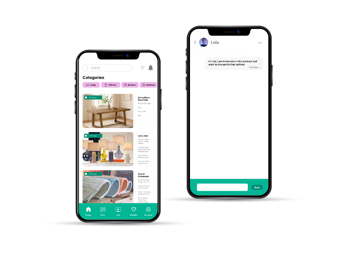
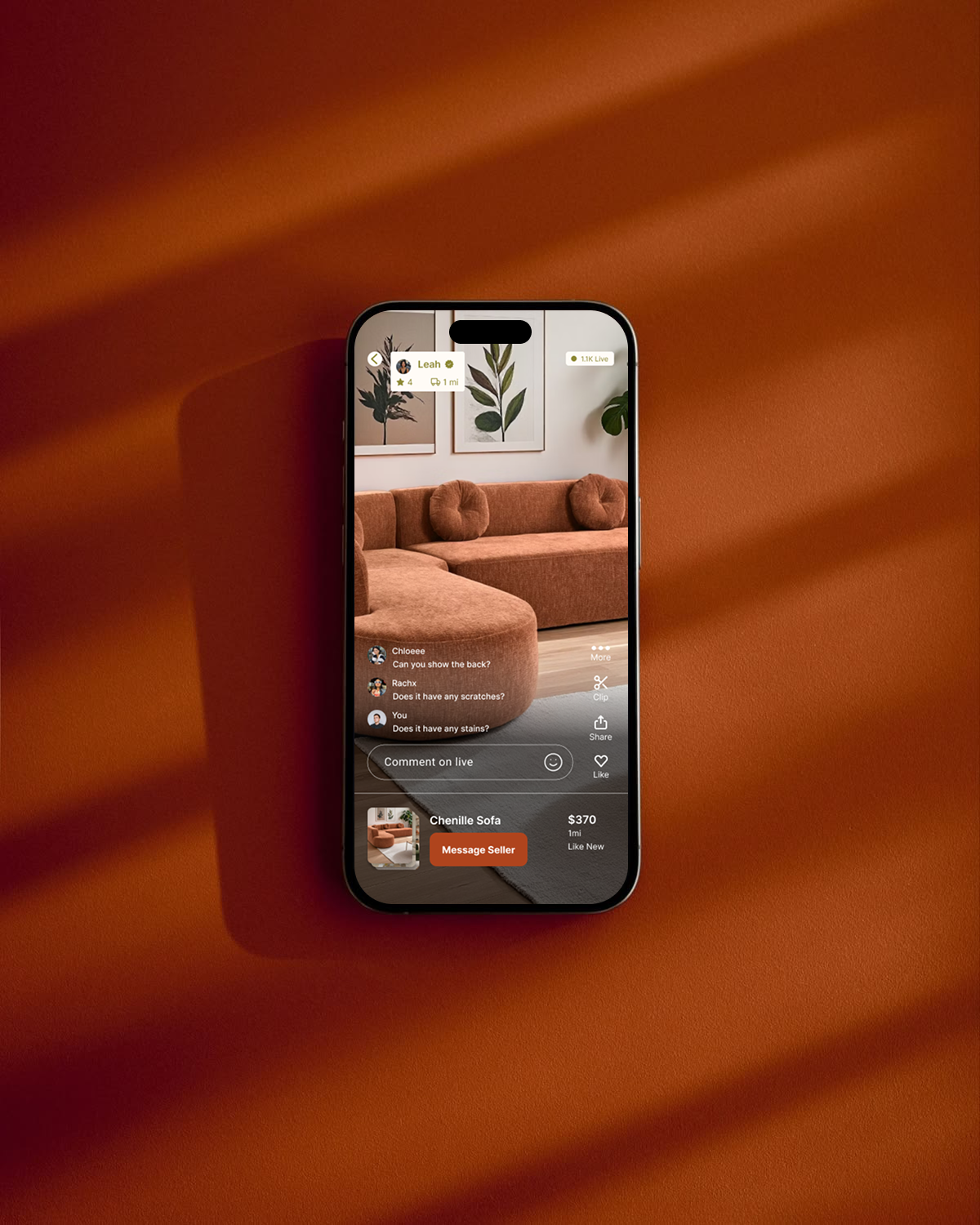
Live Stream Shopping
Inspect items in real time, interact with sellers through live chat, and see product details on the stream card. Chat, likes, and viewer count reinforce social proof and create the energy of shopping together.
Design note
All 17 card sort participants classified live shopping as a primary destination. It earned a dedicated tab in the final navigation.
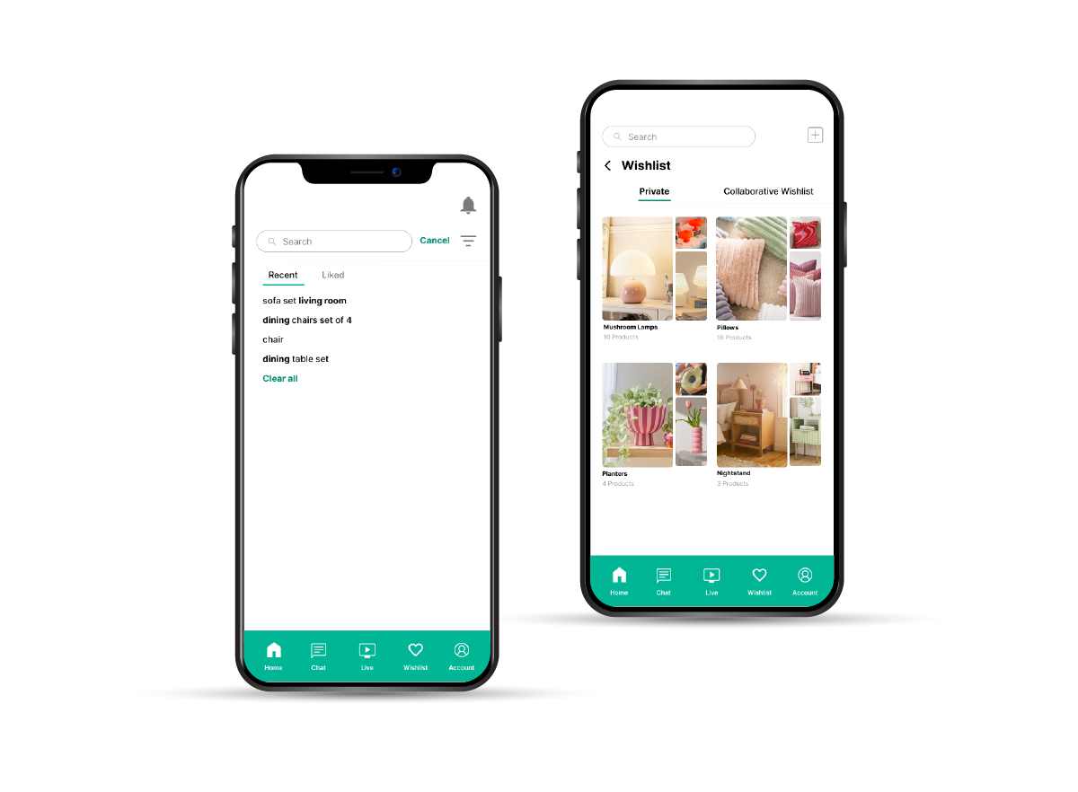
Shared Wishlist
Build shared wishlists with roommates for collaborative apartment furnishing. Private wishlists for individual saves. No more screenshotting listings and pasting them in group chats.
Design note
Addressing the coordination pain point — one of the four core problems identified in discovery research.
Smart Notifications
Alerts for price drops, new listings from followed sellers, wishlist item changes, and live stream schedules. Designed to be useful, not spammy — surfacing only the signals that drive action.
What this project taught me.
This was a class project — so the metrics that matter are what I learned, what feedback validated, and how my thinking evolved as a designer.
Study outputs grounded in evidence
8
Primary interviews to define student pain points
17
Card sorting participants for IA grouping
8
Tree testing participants validating task findability
Research synthesis is as critical as data collection
The insights that shaped ReLoved didn't come from any single interview or test — they emerged from patterns across methods. Affinity mapping and cross-referencing card sort data with interview themes revealed connections I would have missed otherwise.
Designing for trust is foundational in marketplace experiences
Trust isn't a feature you bolt on — it's a structural decision that affects every screen, every interaction, and every piece of information you choose to surface.
Letting failure inform direction
The 0% tree testing success rate was uncomfortable — but it was the most valuable data point in the project. It forced a complete rethink of the information architecture.
Color and visual language shape perception more than expected
The green-to-warm palette switch wasn't cosmetic — it fundamentally changed how participants perceived the app. User perception should drive aesthetic decisions, not personal preference.
What I'd improve next
With more time, I'd run a longitudinal study to understand how trust perception evolves over repeated use. I'd also prototype the onboarding verification flow more deeply and test edge cases around seller-buyer disputes.