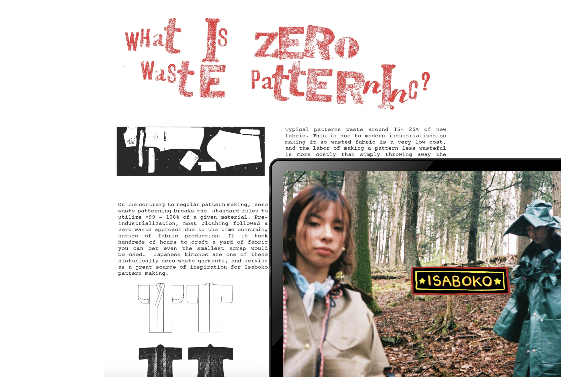
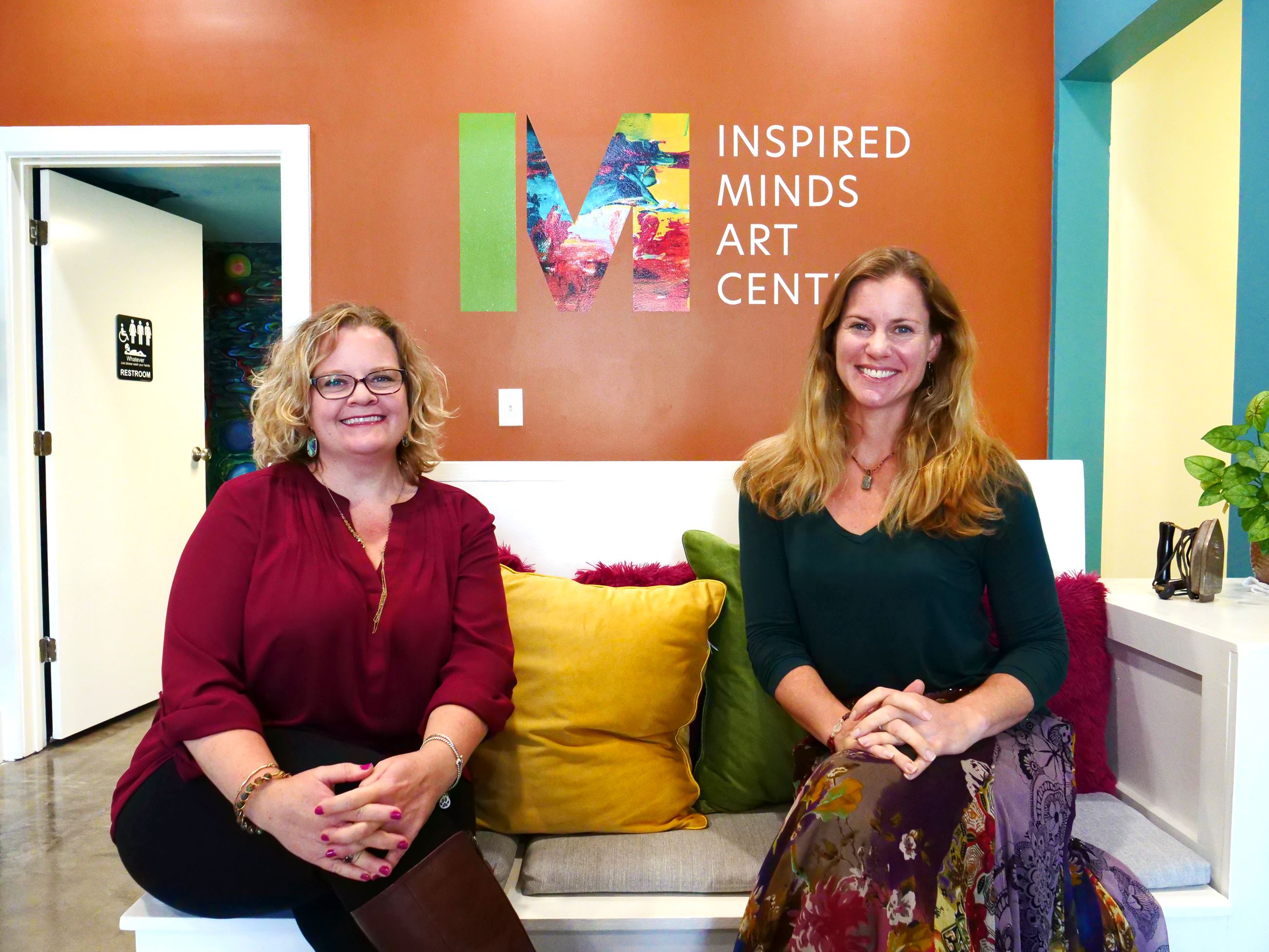
Inspired Minds Arts Center
A 7-week usability research project focused on making a community arts website easier to navigate, scan, and trust.
Inspired Minds already played an important role in its local arts community. My team studied where the website was creating friction, then turned those findings into focused recommendations the client could actually act on.
Turning a community arts website into a clearer path to action.
Inspired Minds Arts Center offers classes, theatre, exhibitions, festivals, and community events in Buda, Texas. The challenge was not a lack of value. It was that visitors had to work too hard to understand where to go, what was current, and how to take the next step.
About the Client
Inspired Minds Arts Center
Located in Buda, Texas, the Inspired Minds Art Center is a locally rooted, creative hub that celebrates the power of the arts. It connects local artists with the wider community through classes, live theatre, art gallery exhibitions, festivals, & public events.

Product
Community arts center website
Goal
Identify usability and navigation issues
My Role
UX Researcher, Usability Tester
Team
4 members
Participants
8 adults, ages 18–50
Duration
7 weeks
Methods
Screener, survey, sitemap, moderated testing
Outcome
3 prioritized recommendations for the client
My contribution
As part of a four-person team, I helped shape the research plan, recruit participants through a screener, conduct moderated usability sessions, synthesize patterns, and translate findings into recommendations the client could use to improve navigation, readability, and information architecture.
What we needed to learn
Where navigation broke down
Could people locate classes, events, theatre information, and rentals without second-guessing where to click next?
What made content hard to scan
Were dense layouts, weak hierarchy, and low-contrast text making important details harder to read than they should be?
How structure affected trust
Did outdated events, duplicate menu paths, and inconsistent categorization make the website feel less reliable?
The website was getting in the way of the experience it was meant to support.
People came to Inspired Minds with clear intent: find a class, check an event, explore theatre, or learn what was happening in the community. Instead, they had to decode structure, sift through clutter, and guess what information was still relevant.
Navigation demanded too much interpretation
Visitors had to choose between overlapping menu paths and labels that did not clearly match how they thought about classes, events, theatre, and rentals.
Visual clutter diluted the important content
Crowded pages and uneven hierarchy made it difficult to tell what to read first, which slowed scanning on key pages.
Dropdowns turned simple tasks into longer hunts
Participants spent too much time inside menus, expanding and rechecking options that repeated content instead of helping them move forward.
Outdated content weakened trust
When events and categories felt stale or inconsistent, people became less confident that the site reflected what was actually happening.
Core Tension
Inspired Minds already had community value. The real problem was that the website made that value harder to discover, trust, and act on.
Inspired Minds Arts Center
View the live website
A lightweight process built to expose real usability issues.
The study moved from recruitment and context gathering into observed behavior. Each method helped us understand not just what was hard to find, but why people were getting stuck.
8
Participants
18–50
Age range
7 weeks
Study timeline
Remote
Moderated sessions
Participant recruitment and screener
We recruited adults ages 18–50 through a screener so the study reflected the kinds of visitors likely to browse classes, events, theatre, and rentals.
Survey
A lightweight survey gave us context on how participants typically discover events and what information mattered before landing on the site.
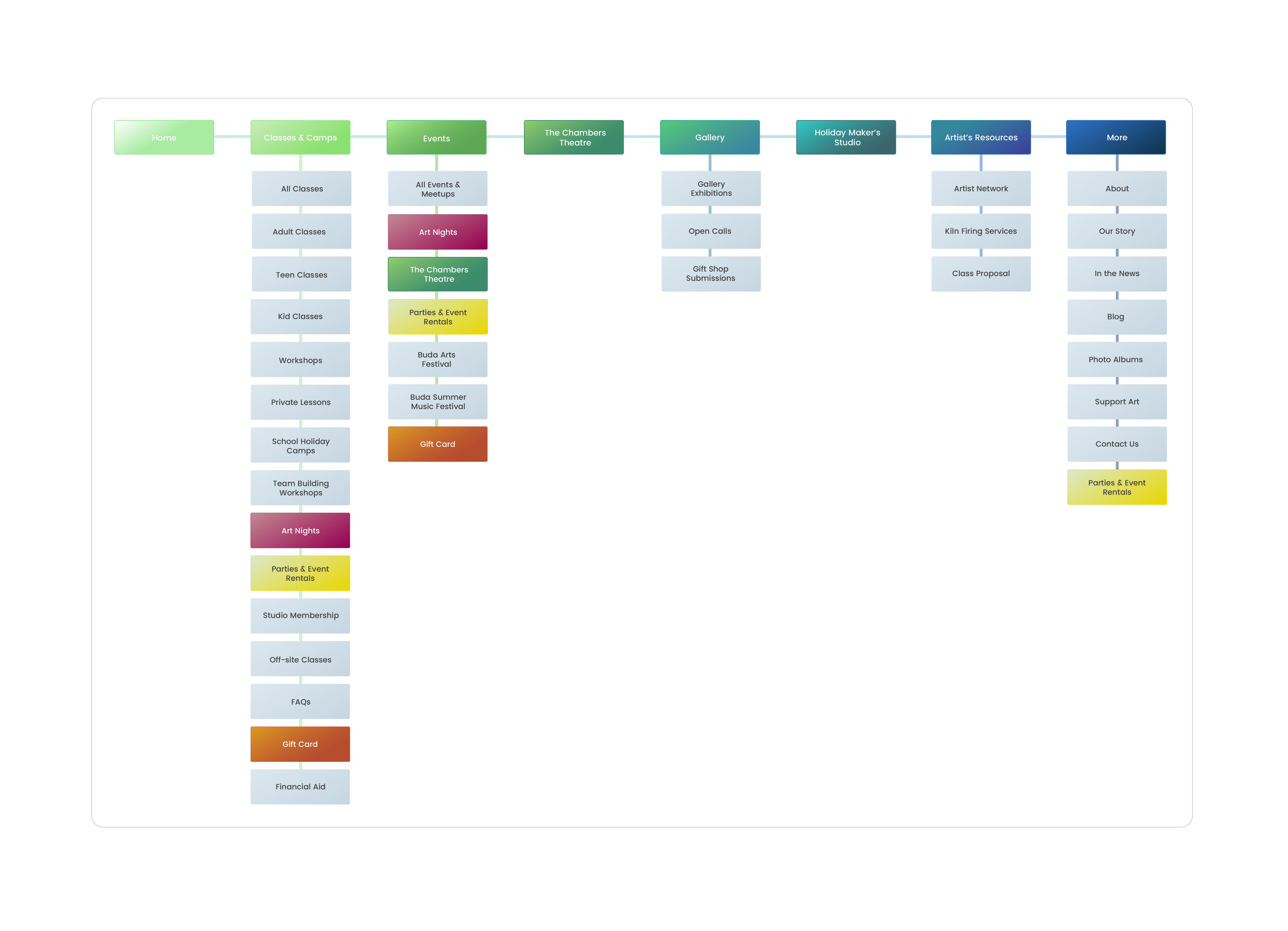
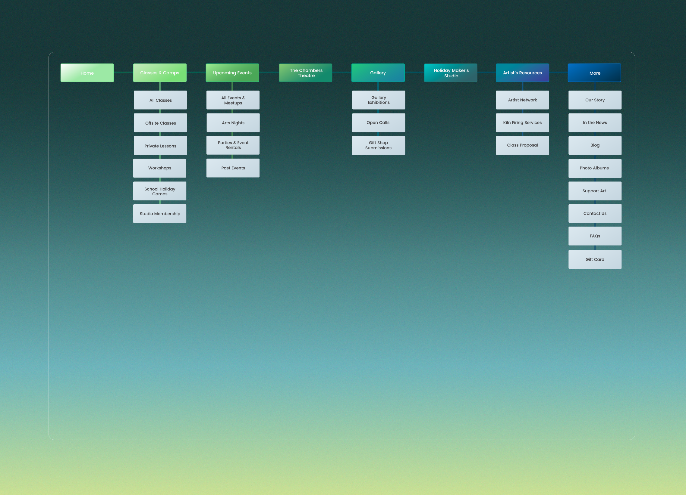
Sitemap creation
Before testing, we mapped the existing information architecture to understand how pages were organized and where structure was already breaking down.
Remote moderated usability testing
We observed 8 participants complete realistic tasks in moderated remote sessions, listening for hesitation, confusion, and workarounds as they navigated.
Why the survey mattered
Participants most often discovered events through social media, with search engines and word-of-mouth following behind. That changed how we framed the site: less as a top-of-funnel discovery tool, and more as the place people visit to confirm details, judge credibility, and decide whether to engage.
Testing Scenarios
5 tasks across 4 use cases
“You have a friend visiting you this upcoming week who likes to attend art workshops. Find one and see when it starts.”
“Your neighbor mentioned that their teenage daughter is interested in taking a pottery wheel-throwing class. Check whether the Inspired Minds Art Center offers this class for non-adults.”
“You want to plan a fun night out with some friends, find out how the Inspired Minds Art Center might be able to accommodate this.”
“Find some upcoming musical events in December that you may be interested in.”
“You want to watch a theatre show. Find out when the next show is scheduled at the Inspired Minds Art Center.”
Four patterns kept repeating across the sessions.
The most important issues were not isolated moments. They appeared again and again as people tried to complete straightforward tasks.
The live site's breadth is part of its charm, but that same richness created friction when structure and hierarchy did not guide people clearly enough.
Overwhelming navigation and inconsistent structure
People struggled to locate information because the site offered too many competing paths and labels that did not feel consistent from one section to the next.
Design implication
Navigation should be simplified around how visitors think about classes, events, theatre, and rentals.
Dense visual clutter undermines readability
Crowded pages made it hard to identify the primary message, which slowed scanning and reduced confidence in where to focus first.
Design implication
Key pages need stronger hierarchy and less competing content, especially on the landing page.
Drop-down menus bury important information
Participants spent too much time inside dropdowns, revisiting options and second-guessing paths before finding the right information.
Design implication
Duplicate items should be removed and the information architecture should be flatter and easier to predict.
Inconsistent categorization and outdated events reduced trust
When categorization felt inconsistent and event information looked outdated, users were less willing to trust what they were seeing.
Design implication
Content needs clearer maintenance rules so categories stay consistent and outdated events do not linger.
Three recommendations grounded in what we observed.
Each recommendation responds directly to a recurring research pattern. The focus was on clear, actionable next steps, not an oversized redesign wish list.
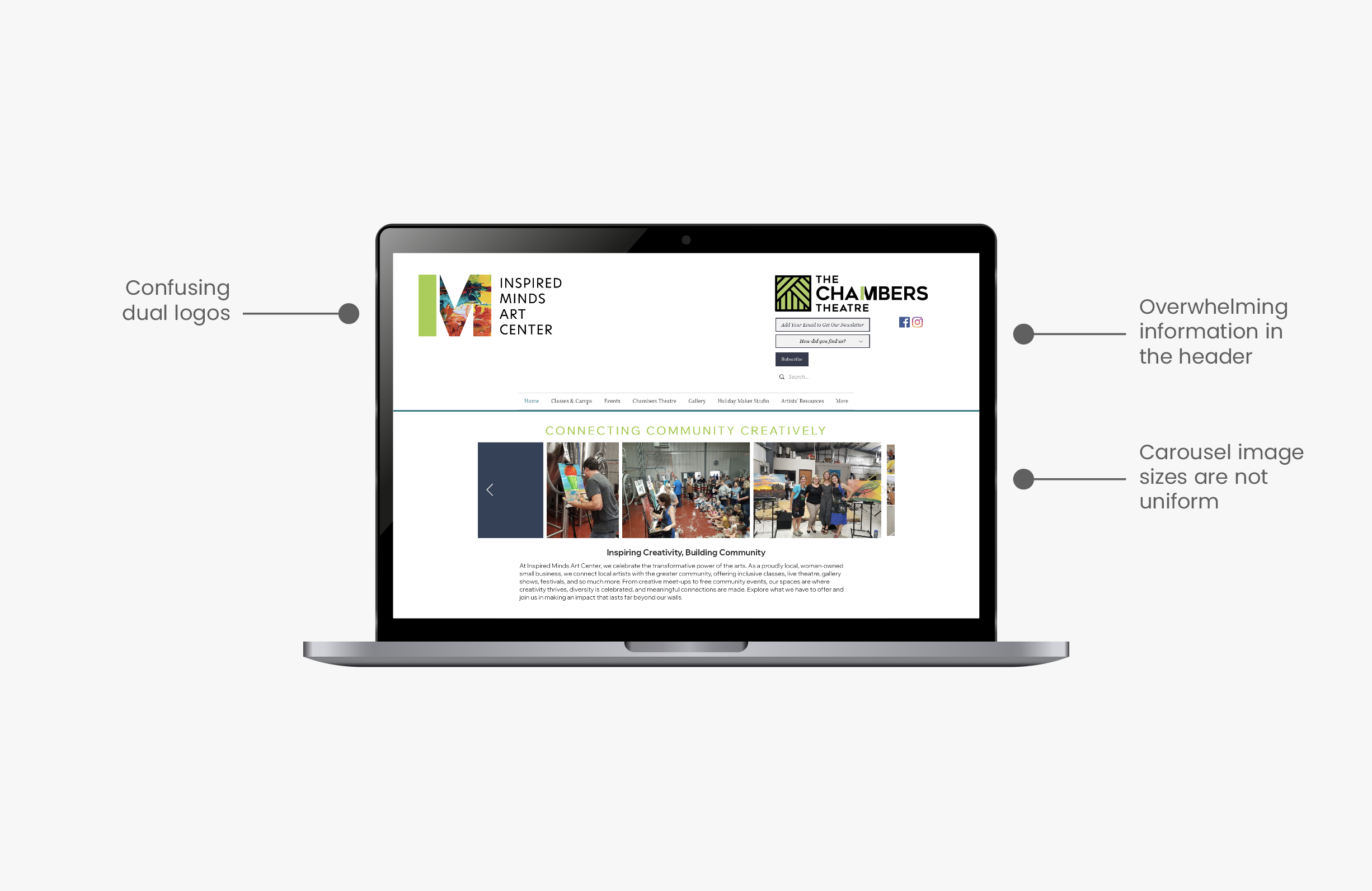
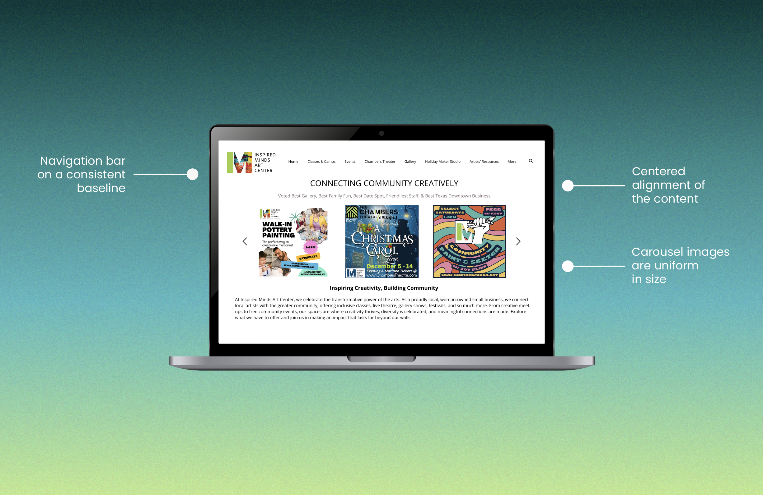
Simplify the landing page to lower cognitive load
“Reduce visual clutter and simplify the landing page.”
The first screen should help visitors understand the center quickly, not decode multiple layers of content. We recommended removing non-essential header elements, clarifying the primary message, and prioritizing the paths most people were trying to take first.
Observed issue
The homepage asked visitors to process too many competing elements before they could orient themselves.
Why it matters
A calmer entry point helps people understand what Inspired Minds offers and where to go next.
Original layout with competing visual elements
Simplified direction with clearer hierarchy and focus
Remove duplicate navigation paths and clarify the sitemap
We recommended removing duplicate dropdown items and reorganizing the sitemap around fewer, clearer categories. The goal was not to add more navigation, but to make the existing content easier to understand and easier to reach.
Observed issue
Important information appeared under multiple menu paths, which made the structure feel unpredictable.
Why it matters
A cleaner IA reduces hesitation and helps visitors build a clearer mental model of the site.
Improve legibility with stronger contrast and type hierarchy
“Increase font weight for key text elements and improve contrast for important information.”
We recommended increasing contrast on event cards and key text elements, strengthening font weight where information needed emphasis, and using hierarchy more intentionally so visitors could scan dates, labels, and titles without extra effort.
Observed issue
Thin typography and low-contrast grays made event details harder to read and harder to scan quickly.
Why it matters
Stronger type hierarchy improves readability, accessibility, and overall confidence in the content.
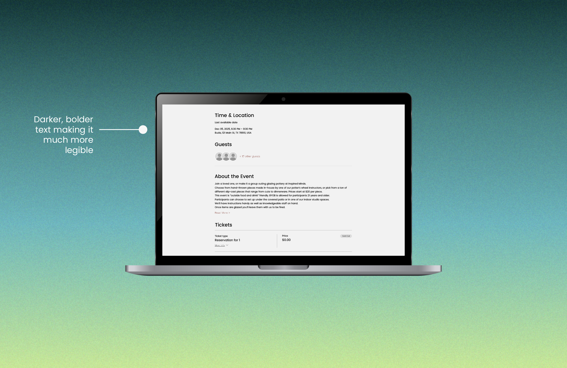
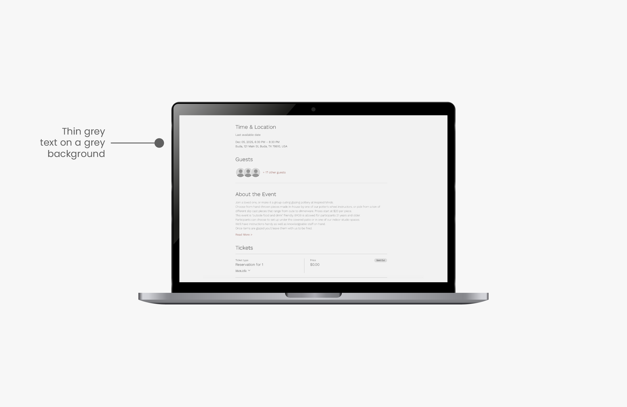
Original event card with weaker contrast and hierarchy
Improved event card with clearer emphasis and readability
What changed as the project came into focus.
The project became stronger once we stopped treating every issue as equal and started prioritizing what the research most clearly supported.
We started too broad
Early on, it was tempting to frame the work as a full redesign problem. But that would have produced a less useful outcome for a client who first needed clarity on what to fix.
What changed
We narrowed the final output to three prioritized recommendations tied directly to recurring usability evidence.
Testing changed what we prioritized
The website had several visible problems, but moderation showed that navigation and categorization were creating the deepest friction during realistic tasks.
What changed
Information architecture became a central recommendation rather than just one issue among many.
Visual polish was not the real fix
Improving aesthetics alone would not have solved the core experience problems. People needed clearer hierarchy, stronger legibility, and more predictable structure.
What changed
The final recommendations stayed anchored in usability: simplify, reorganize, and improve readability.
A qualitative outcome, framed honestly.
This project did not end with a shipped redesign or performance dashboard. Its value was in giving the client a clearer view of what was breaking, why it mattered, and what to prioritize next.
User Retention
Improvements were made to support stronger user retention and repeat engagement.
Customer Satisfaction
Strengthened customers' connection to the Inspired Minds Arts community.
Business Value
Supported both user needs and the organization's long-term sustainability.
Client reception
The presentation worked because it translated research into plain-language priorities. Instead of handing over a long report of friction points, we framed the work around the few changes most likely to improve usability first.
For me, the strongest outcome was seeing how much more actionable research becomes when it is organized around decisions. The project reinforced that a good case study should show not only what was found, but how those findings changed the path forward.
Presenting to our Client
We were excited to see that the findings resonated with the Inspired Minds team & were viewed as clear, actionable insights.

Design Studio incubated at Pratt Institute
Center for Digital Experiences
We also recommended founders, Sinead & Susan partner with the Dx Center in the following semester for a full website redesign to implement our recommendations in practice.
View the reportWhat I took away from the project.
The most important lesson was not just how to find issues, but how to frame them so they become useful design direction.
Turning research into action is a design skill
The hardest part was not spotting friction. It was distilling scattered observations into recommendations that felt specific, credible, and immediately useful.
Usability testing gives structure to vague concerns
Issues like clutter or confusing navigation can sound subjective until you watch multiple people struggle in similar ways. Testing made the priorities much clearer.
IA, hierarchy, and accessibility are deeply connected
This project showed me that structure and readability are not separate layers. If categories are unclear and visual hierarchy is weak, the whole experience becomes harder to trust and harder to use.
The best improvement is often simplification
The recommendations that mattered most were about removing duplication, reducing visual noise, and making the site easier to scan. Better usability did not require adding more. It required making the existing experience clearer.