Redesigning a Brooklyn based, zero-waste, solarpunk fashion label for a digital-first future.
A 14-week design partnership translating an Asian-American fashion label from in-person pop-up storefront to a clear, collector-driven online destination.
isaboko.com
Built & shippedSpring 2026
Overview
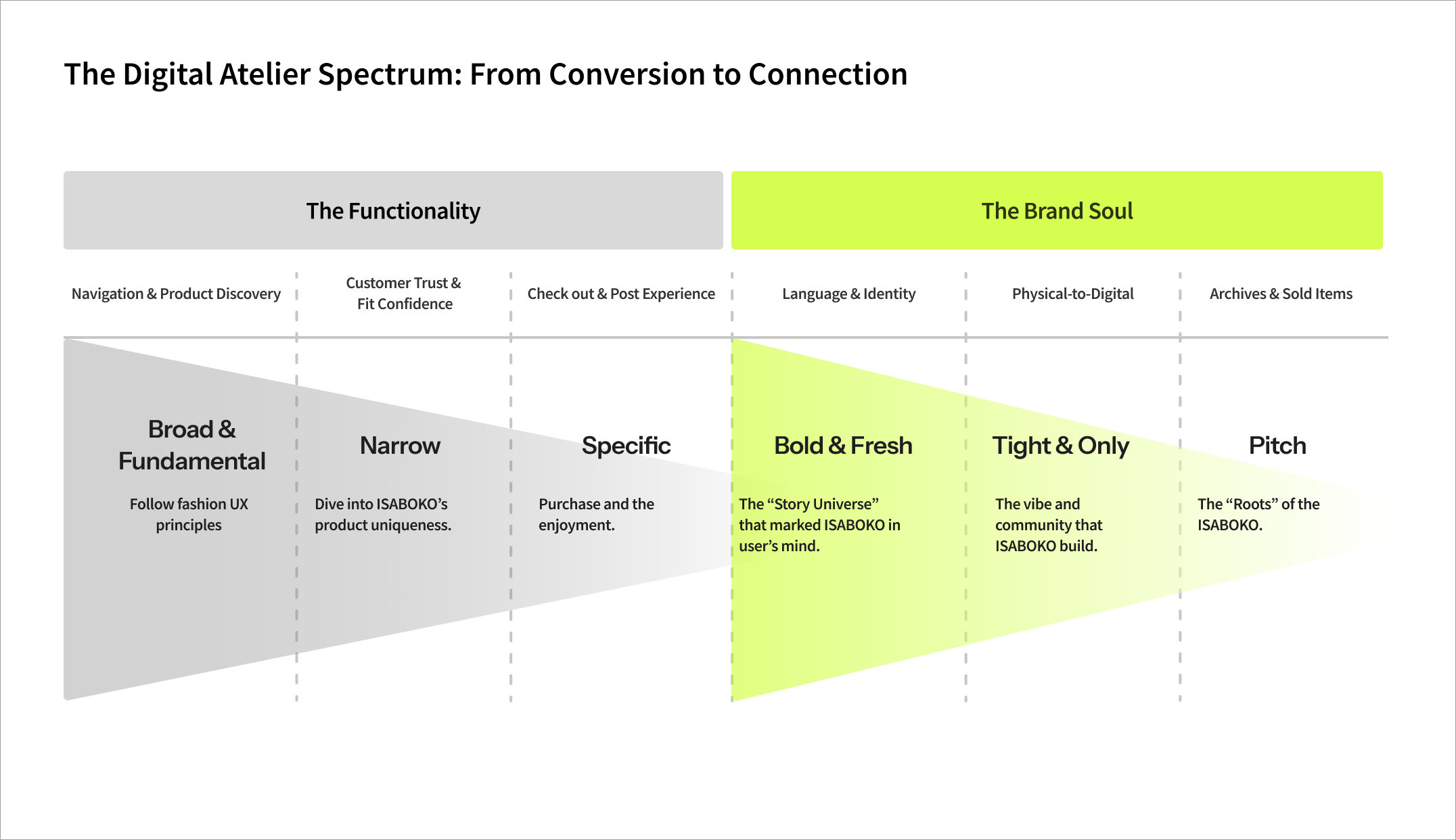
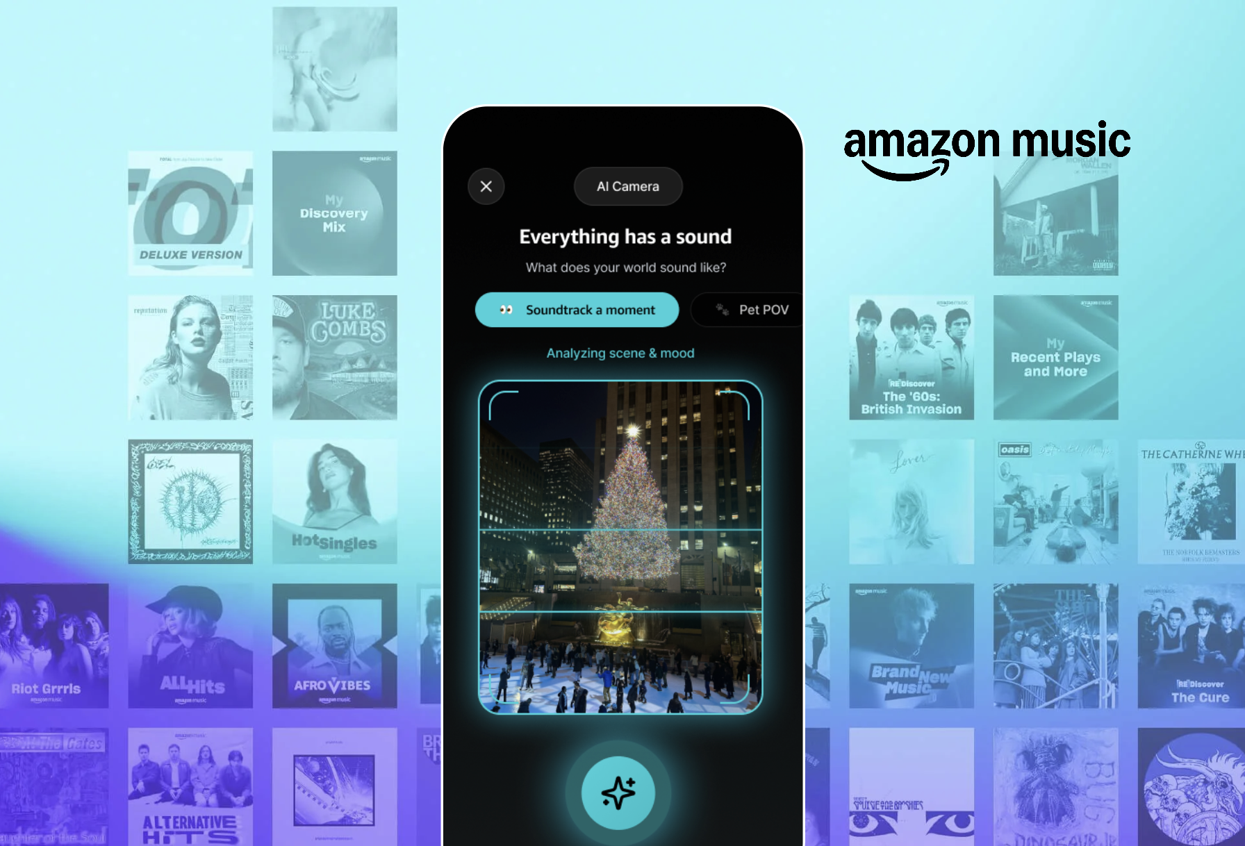
The Digital Atelier.
This case study documents the team’s journey in redesigning the Isaboko digital experience. By shifting the site from a passive portfolio to an active, high-performance “Collector’s Atelier,” we bridged the gap between artistic storytelling and e-commerce clarity. From strategic research into user trust to the creation of a hybrid navigation system, we built a digital infrastructure ready to support Isaboko’s global growth.
Client
Isaboko
Scope
Strategy, UX Research, Website Redesign
Team
4 Members + Faculty Advisor
Tools
Figma, FigJam, Shopify
The Brand
Zero-waste, gender-free, and rooted in heritage.
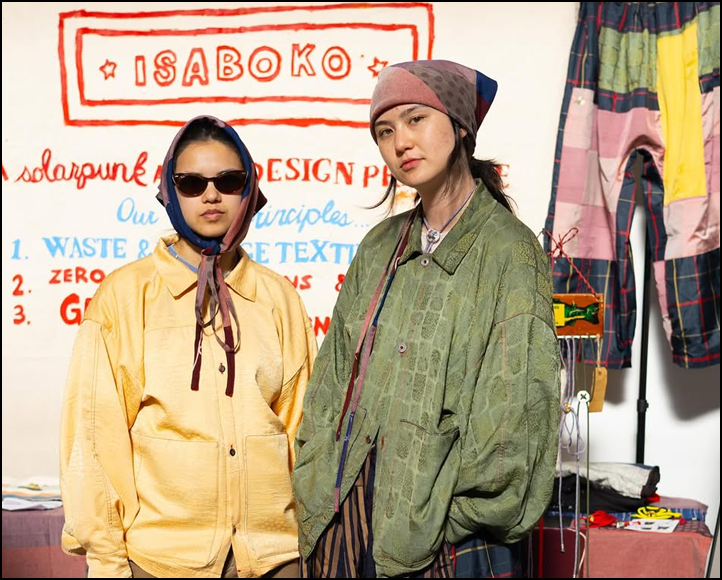
Isaboko is more than a fashion label, it is a "clothes-making project" rooted in the solarpunk ethos, transforming vintage Japanese kimonos and obis into modern, gender-free garments. The label sits at the intersection of craft, sustainability, and a vision of fashion that resists overproduction. Founder Izzy Li Kostrzewa (they/them) created a brand that resonated deeply with a community of "conscious collectors." For years, Isaboko thrived in physical spaces. Pop-up markets in New York, Chicago, and LA became the heartbeat of the brand.
100%
Zero-waste, vintage source
Every garment is built from existing fabric, no new textile or threads produced for Isaboko's collection.
1-of-1
Each piece is unique
Cuts, patterns, and trims are dictated by the kimono being reworked, not a production template.
80%
Of sales were in-person
Pop-up markets carried the brand. Online presence existed as a portfolio, not a storefront.
Founder Note
Izzy Li Kostrzewa runs Isaboko as a one-person practice with a clear philosophy: degrowth over scale, ritual over routine, garments that hold memory of their first life. Their customers don’t just buy clothes, they buy the story of who wore the kimono before.
Isaboko founder Izzy Li Kostrzewa wearing a Zatsuyo jacket at Isaboko’s pop-up.
The Problem
Navigation Friction Created the Trust Gap.
Despite a loyal following and high social media engagement, the brand’s digital presence reached a respite. While the site functioned beautifully as an artistic portfolio, it lacked the “digital trust infrastructure” required for high-stakes e-commerce. Customers found the one-of-a-kind inventory difficult to navigate, and the intentional, oversized silhouettes were often misinterpreted as a “poor fit” rather than a design choice. The numbers told a sharp story.
0.86%
Online conversion
Far below industry benchmarks for craft fashion.
<5%
Of total sales
Web revenue was a rounding error against pop-up sales.
Why Design Matters
UX as the Bridge for Artistic Portfolio, E-Commerce, and Global Sales
The urgency for a redesign was driven by a major operational pivot. As Isaboko began expanding production to a factory in Taiwan, the brand moved from a “one-of-one” studio model to a “small-batch” scalable model. This transition meant a several needs:
01
Increased Inventory
A larger volume of products that needed clear categorization.
02
Global Reach
The need for a site that could sell the brand story without Izzy being physically present.
03
Higher Stakes
The digital experience now had to justify luxury price points through professional clarity and seamless functionality.
For our team, the goal was clear. We weren’t just redesigning a website, we were building the operational engine for Isaboko’s next chapter.
How might we
…balance Isaboko’s brand uniqueness with a shopping experience that feels clear, predictable, and easy to navigate?
Research
Three lenses on the same store.
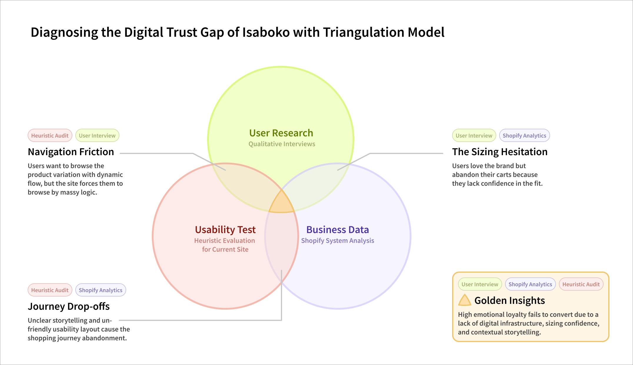
To understand a site that worked beautifully as a portfolio and poorly as a storefront, we triangulated quantitative behavior, expert audit, and lived motivation.
01
Shopify Analytics
Pulled traffic, conversion, and drop-off data from the existing site to locate where intention turned into abandonment.
02
Heuristic Site Audit
Walked the live site against a heuristics framework, flagging trust, hierarchy, fit, and findability gaps.
03
Qualitative Interviews
Spoke with collectors, aspirational shoppers, and the founder to understand motivation, hesitation, and identity.
Interviews surfaced two clear groups already shopping Isaboko, and one we couldn't reach. The redesign had to serve both primary archetypes without flattening either. The Loyal Collector and the Aspirational Explorer have different budgets, but they want the same thing: a tangible connection to Isaboko's craft.
Archetype 01
The Loyal Collector
Knows the brand from pop-ups. Trusts the founder personally. Browses for new drops, specific patterns, and pieces tied to material lineage.
Comes back monthly, checks for archive updates
Decides based on textile, not size
Will pay premium because they understand the value
Archetype 02
The Aspirational Explorer
Digital-native, values-aligned, but new to the brand. Curious about sustainable fashion. Entry barrier is high: pricing, fit, and provenance feel opaque.
Discovers via Instagram or editorial
Hesitates on price and sizing without explanation
Needs context before commitment
Mapping the Core Audience: The Loyal Insider vs. The Aspirational Explorer
The Brand’s Gateway Product
The Patch Club
We identified the Patch Club, a low-cost monthly subscription, as the brand’s most powerful “gateway” product.
For the Aspirational Explorer, the Patch Club should be the perfect first step into the Isaboko ecosystem. However, our audit and interviews revealed a missed opportunity. Because the value and “how-it-works” of the subscription aren’t transparently communicated, potential customers remain hesitant.
If the digital experience can’t build enough trust to sell a $15 subscription, it certainly cannot support a $500 jacket.
Isaboko founder Izzy Li Kostrzewa shot wearing a patchwork jacket.
Sewing an Isaboko patch onto a garment.
This “Gateway Gap” served as a micro-example of a much larger systemic problem. To understand why even the simplest entry points were failing, we zoomed out to look at the business as a whole.
Out of scope · future research
A third group, “Off-Grid VIPs,” surfaced in interviews. High-value buyers who skip the site entirely and message Izzy directly. Digitizing that concierge intimacy without flattening it is the next chapter for this work.
Synthesis & What We Found
Three friction points doing all the damage.
Triangulating analytics, audit, and interviews, the same three problems kept surfacing. They became the spine of the redesign.
01
Discovery & Navigation
The Friction of “One-of-a-Kind”
The Business Data
Shopify analytics revealed the steepest drop-off occurred right between the homepage and the product pages.
The Site Audit
The current architecture forced a standard e-commerce grid onto non-standard inventory. Because every item is unique, users were overwhelmed by a sea of disconnected garments and variations.
The User Insight
“I don’t just shop for a shirt, I look for the fabric, the history, or a specific vintage kimono pattern.”
— P3
Design Insight
Build a Hybrid Information Architecture. We need to allow users to navigate not just by category (tops/bottoms) but by collector behavior (material, textile history, and archive).
02
Usability & Trust
The Sizing Confidence Barrier
The Business Data
High cart abandonment rates indicated users were hesitating at the point of purchase.
The Site Audit
Isaboko utilizes zero-waste, gender-free, and intentionally oversized silhouettes. Without the founder there to explain how the garment is supposed to drape, standard size charts created severe usability friction.
The User Insight
“I love the pieces, but at this price point, I am terrified it’s going to swallow my frame. I need to know exactly how it fits before I invest.”
— P1
Design Insight
Normalize the Fit. We must introduce robust sizing clarity on the Product Individual Details Page (PIDP), including visual fit guides, model dimensions, and draped-vs-flat imagery, to remove the risk of “poor fit” misunderstandings.
03
Brand & Connection
The Storytelling Dead-End
The Business Data
80% of customer acquisition happens in person, driven by conversations with the founder, Izzy.
The Site Audit
The brand’s rich solarpunk and zero-waste narrative was trapped on a single, static “About” page. The actual shopping pages felt stripped of the brand’s soul.
The User Insight
“Buying Isaboko is a point of pride. I am investing in the maker’s mission and the reclaimed materials just as much as the clothing itself.”
— P5
Design Insight
Distribute the Story. The brand narrative cannot be a footnote. We need to weave the story of the reclaimed textiles and Asian-American heritage directly into the product pages and other flows, turning the website into an automated storyteller.
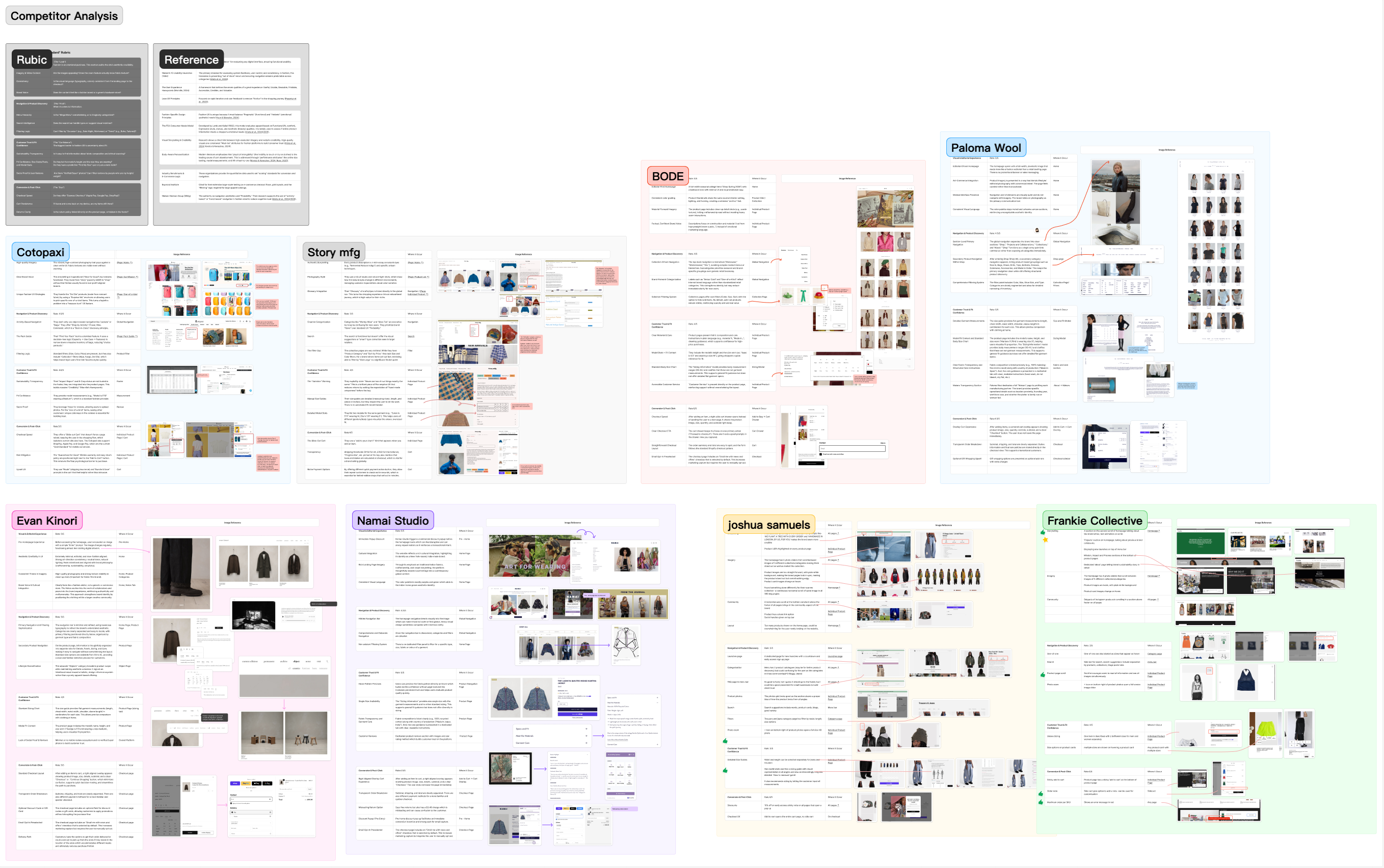
Competitive Benchmarking
What craft-forward sites do well.
Our strategy was to redesign Isaboko.com as a Collector’s Atelier, a space that prioritizes discovery, education, and the unique “maker-to-user” relationship.
To define what a “High-Performance Atelier” looks like in the digital space, we benchmarked Isaboko against eight industry leaders in the high-end, one-of-a-kind craft space. This competitive analysis allowed us to distill Fashion UX Industry Principles into a strategic blueprint for growth.
Standard 01
Progressive disclosure
Dense product info revealed through tabs rather than dumped into one scroll, letting users dig only as deep as they need.
Standard 02
Variation transparency
Brands that name the unevenness, "slight variation in dye, weave, or repair," convert better than ones that hide it.
Standard 03
Fit confidence models
Model height, garment measurements, and visual size guides reduce return rates and shrink the anxiety gap before checkout.
Standard 04
Distributed narrative
Mission and craft stories don't live on one page, they're woven through product detail, cart, and confirmation moments.
Overview of the competitor analysis with 8 zero-waste brands.
Strategic Framework
Four pillars of the redesign.
The strategy translated the three friction points into four concrete moves, each one a directive for the visual and architectural design that followed.
01
Pillar
Product detail page as conversion engine
Build the PIDP to carry the founder's voice, tabbed info, textile lineage, sizing clarity, and quiet reassurance baked into the flow.
02
Pillar
Discovery-led navigation
Let users browse by material, textile, or archive, not just by garment category. Match how collectors actually look for pieces.
03
Pillar
Multiple pathways to ownership
For out-of-stock pieces: notify-me, custom-order inquiry, and waitlist. The story doesn't end at "sold."
04
Pillar
Patch Club as front door
The membership program moves from footnote to navigation-level priority, repositioning the most committed relationship as the entry point.
The overview of the new information architecture for a hybrid navigation system.
Design Artifact
Translating Strategy into Screens by Building a High-Converting Atelier.
With our strategic blueprint established, we set out to bring the “Collector’s Atelier” to life. The following design artifacts represent the culmination of our research, user insights, and industry benchmarking. Our primary goal was to translate the warmth, trust, and education of an in-person pop-up into a scalable, high-converting digital experience.
Our design mandate required us to bridge the gap between standard e-commerce usability and the immersive storytelling of Isaboko’s physical pop-ups.
Below is the evolution of Isaboko.com. Through a new foundational design system, targeted before-and-after comparisons, and an interactive prototype, you will see exactly how we dismantled the “Trust Gap.” By redesigning the Information Architecture for discovery and rebuilding the Product Individual Detail Page (DIPD) as a conversion engine, we created a digital space where Aspirational Explorers finally feel confident enough to become Conscious Collectors.
A preview of the new design system for a future-ready Isaboko.
Design Solutions
Where the strategy met the screen.
Each pillar translated into a set of redesigned screens. The visual language stayed faithful to Isaboko’s editorial restraint, but each surface now does the work the founder used to do in person.
Homepage
Lead with the story, surface the program.
Reworked hierarchy gives the brand narrative its own moment and pulls Patch Club from the footer up to a primary call to action.
Product category
Hybrid filtering by material and textile.
Instead of forcing a single category structure, browsing supports filters that map to how collectors think, pattern, kimono type, archive year.
Sizing, fit, fabric origin, and care notes are organized into progressive-disclosure tabs. Every garment carries its kimono's story alongside the price.
Textile archive
A library for the collector's eye.
A new browsing surface that treats fabric and pattern as first-class, not metadata buried under the product image.
Outcomes
From class brief to active blueprint.
The deliverables didn't sit in a PDF. They were handed to Isaboko's external marketing consultants and engineering team to guide the live site rebuild as production expanded into Taiwan.
For the founder
A redesign positively received as the brand's voice in a form that scales.
A design system they can hand to engineering without re-explaining the brand.
An IA that maps to how they already talk about their work in person.
For the build team
Wireframes, prototypes, and component-level direction for the next dev sprint.
Clear pathways for out-of-stock and custom-order requests.
A consistent way to weave the brand mission across every screen.
The Client Response
A UI that held the brand’s soul
When we presented the final design system and prototype to the founder, Izzy, the response was highly positive. They were deeply impressed by how the new UI captured the vibrant, solarpunk “soul” of Isaboko while introducing the rigorous e-commerce logic needed to convert hesitant shoppers. The team successfully translated the warmth of an in-person pop-up into a scalable digital platform.
“
The team understood what Isaboko is about, not just as a label but as a practice. The redesign feels like the brand grew a digital body without losing what makes it human. It is the version of the storefront I have been trying to describe out loud for years.
Izzy Li Kostrzewa
(they/them) · Founder, Isaboko
Next Steps
Real-world implementation.
The research, strategy, and prototypes don't end with the semester. Izzy is using the work as a foundational blueprint for ongoing collaborations with external marketing consultants and engineering partners as production expands into Taiwan, with the redesign guiding handoff and onboarding for a new generation of conscious collectors.
Handoff
From class brief to working blueprint.
Deliverables moved directly into Izzy’s next phase: marketing consultants leaning on the archetypes and brand framing, engineering teams building from the component direction, and a founder confident that the next round of growth keeps the soul of the practice intact.
Strategy doc carried forward by marketing consultants
Prototype handed to the engineering team
Design system as the source of truth for new screens
Production expanding into Taiwan in tandem
Thanks to Prof. Rachel Ginsberg for all their guidance throughout the project.
Reflection
Standardize the journey, not the brand.
The biggest insight didn't come from the screens, it came from learning where to be experimental and where not to be.
→
Experiment with story, not navigation.
Our first instinct was to invent a navigation system as poetic as the brand. The data and the interviews pushed back hard, users wanted predictability at the structural level so they could pay attention to the storytelling everywhere else.
→
Conversion is a trust problem before it's a UI problem.
Cart abandonment wasn't about the cart. It was about sizing, provenance, and price-trust. Fixing the funnel meant designing the trust signals upstream, on the PIDP, not redesigning the checkout.
→
The brand's voice lives in details, not banners.
Patch Club's repositioning, textile-lineage cards, variation transparency, Isaboko's identity strengthened when it was distributed across small product-level moments, not amplified through louder homepage hero copy.
→
What's next.
The Off-Grid VIP segment remains unexplored. Digitizing concierge intimacy, without flattening it into a generic premium tier, is the next research thread, and the project where this work is most likely to grow.
You’ve reached the end, ready for another experience?