Case Study
RoleAccessibility Researcher
Timeline1 month
ClientWikimedia Foundation
TypeClient Project
Wikipedia×Wikimedia Foundation

Wikipedia Accessibility Audit

An audit of the Wikipedia iOS app's Explore & Discovery experiences, evaluating WCAG conformance for screen reader users after iOS 26's Liquid Glass adoption.

A four-week study of how a platform redesign reshapes accessibility for screen reader, low-vision, and motor-impaired users, and what it takes to close the gaps it opens.

Overview

Auditing the Wikipedia iOS app after Liquid Glass. iOS 26

When Apple shipped iOS 26 in 2025, it introduced Liquid Glass, a new design language built on translucency, layering, and motion. For sighted users, the redesign was widely praised. For users who rely on accessibility features, it broke things.

This raises a question that matters beyond a single app

What happens to accessibility when a mission-driven application inherits an aesthetic-driven platform redesign?

Wikipedia is one of the most-used non-commercial apps in the world, with an explicit organizational commitment to access. iOS 26 is one of the largest mobile design changes in a decade. The intersection makes Wikipedia’s iOS app a useful site for studying how platform-level visual changes propagate to accessibility regressions in the applications built on top of them.

40+

Distinct regressions

4

Accessibility dimensions

2.1 / 2.2

WCAG conformance

Over four weeks, our team audited the Wikipedia iOS app under iOS 26 against WCAG 2.1 / 2.2, with focus on the Explore and Discovery experiences. We documented forty-plus distinct accessibility regressions across VoiceOver, visual contrast, Dynamic Type, and interaction. This case study presents the findings, the methodology, and the broader pattern they suggest: that platform redesigns can quietly undo years of accessibility work in the applications that inherit them.

Timeline

1 month.

Team

4 members.

Skills

Web Accessibility, UX Research.

Tools

iOS Accessibility Tools, Figma, FigJam.

Why This Case

Two things make Wikipedia's iOS app a useful site for studying platform-level accessibility regression.

01

It serves a mission, not a market.

The Wikimedia Foundation does not optimize for engagement, retention, or monetization. Its stated commitment is to make knowledge accessible to everyone, in every language, on every device. That mission is incompatible with quiet accessibility decay.

02

It cannot opt out of the platform.

Like every iOS app, Wikipedia inherits Apple's design language. When Apple changes that language, Wikipedia inherits the change, whether or not the change serves its users. The application is bound to the platform even when their priorities diverge.

This tension, between an application’s accessibility commitments and a platform’s design choices, is not unique to Wikipedia. It exists in every iOS app built by an accessibility-conscious team. Wikipedia is just where the gap is most visible.

About the Client

Wikimedia.org

The Wikimedia Foundation is the nonprofit organization that hosts Wikipedia and a family of free-knowledge projects. Its mission is to make knowledge accessible to everyone, in every language, on every device.

Wikimedia Foundation context image

Client Objective

“With the recent adoption of Liquid Glass (iOS 26) in the Wikipedia app, we need to understand how this major operating system update has impacted the accessibility of the application. This review will help us identify opportunities for improvement and ensure we’re leveraging new platform capabilities effectively.”

Platform & Version

  • Operating System: iOS 26 (Liquid Glass)
  • App Version: Wikipedia Public Beta
  • Devices: iPhone running iOS 26 (primary)

Features Tested

Places, Explore, Saved, Activity, and Search.

The Explore and Discover experiences, how users browse and discover content beyond search.

Accessibility Focus

WCAG 2.1 / 2.2 Conformance.

We evaluated the app against the Web Content Accessibility Guidelines, with emphasis on Level AA conformance as the baseline standard, across all four WCAG principles.

Perceivable

Information and UI components must be presentable to users in ways they can perceive.

Operable

UI components and navigation must be operable by every user, regardless of input method.

Understandable

Information and the operation of UI must be understandable, with predictable patterns and clear language.

Robust

Content must be robust enough to be reliably interpreted by a wide range of assistive technologies.

Project Goals

Four goals, one outcome: A clearer path to conformance.

The audit had four operational goals, framed to balance two priorities: producing actionable findings for the Wikimedia team, and surfacing patterns that speak to the broader question of platform-application accessibility dynamics.

  1. 01

    Audit the Explore & Discovery experience for accessibility.

    Evaluate the app against WCAG 2.1 / 2.2 standards across VoiceOver, Dynamic Type, contrast, focus management, and touch targets.

  2. 02

    Build a prioritized recommendations framework.

    Sort fixes into Critical, Important, and Enhancement tiers, justified by impact, complexity, and available resources.

  3. 03

    Develop a clear WCAG compliance strategy.

    Map every issue to a specific success criterion and explain how each recommendation closes the gap.

  4. 04

    Assess the impact of iOS 26's Liquid Glass redesign.

    Identify how the new visual direction affects accessibility, and where it creates new opportunities or barriers.

Accessibility Audit

Four lenses, four kinds of users.

To understand where the app falls short on accessibility, we focused on four major areas, VoiceOver for screen readers, Visual Audit for contrast and hierarchy, Dynamic Type for text scaling, and Interaction for navigation and orientation, to cover how screen reader users, low-vision users, people who scale up text, and users navigating with limited motor input experience the app.

  • VoiceOver Audit

    Evaluate navigation, focus order, labels, and screen reader announcements.

  • Visual Audit

    Assessed color contrast, visual hierarchy, touch targets, and interface clarity.

  • Dynamic Type Audit

    Tested text scalability, layout reflow, and content legibility at larger sizes.

  • Interaction Audit

    Examined navigation patterns, orientation, and how users return, resume, and move through content.

VoiceOver accessibility audit board

Every issue mapped back to a specific WCAG criterion.

Places tab VoiceOver issues annotated

VoiceOver gaps annotated screen-by-screen.

Severity table prioritizing fixes by urgency

Sorted by urgency: critical, medium, and long-term fixes.

This is what our full audit looked like behind the scenes. Additionally, we also sorted every issue by urgency and tied it back to a clear recommendation for the Wikimedia team.

General Challenges with iOS 26

The redesign is beautiful, but not equally accessible to everyone.

Before auditing the Wikipedia app specifically, we mapped the broader friction Liquid Glass introduces, four recurring patterns we saw across the platform that disproportionately affect users relying on accessibility features.

Contrast & legibility

Transparent layers can make text, buttons, and navigation harder to see, especially in dark mode or over colorful wallpapers.

Sensory overload

Layered translucency, motion, and shifting backgrounds can overwhelm users who are sensitive to visual complexity, especially during prolonged use.

Discoverability

Floating or shifting controls can make interface patterns less predictable, so users have to work harder to find actions they expect in a consistent place.

Motion sensitivity

Some users report eye strain, dizziness, or vertigo-like symptoms, suggesting the design can be rough on people who are sensitive to motion and visual effects.

Our Process

Four weeks, four steps.

A linear cadence from grounding the work in users, to auditing, to synthesizing findings, to proposing fixes.

  1. 01

    Week 1

    Researching & Building the Personas

    Grounded the audit in real users — mapping needs across cognitive, visual, motor, and temporary disability profiles.

  2. 02

    Week 2

    Auditing the Wikimedia iOS app

    Tested Places, Explore, Saved, Activity, and Search against WCAG 2.1 / 2.2 with VoiceOver, Dynamic Type, and contrast tooling.

  3. 03

    Week 3

    Summarizing Key Findings & Organized by Severity

    Synthesized observations into a structured set of findings, grouped by feature area and severity.

  4. 04

    Week 4

    Recommendations & Solutions

    Translated findings into a prioritized strategy, with concrete fixes mapped to specific WCAG success criteria.

Research

Two personas, grounded in client usability data.

Wikimedia shared usability research that informed how we framed our audit subjects. From that data, we built two composite personas representing the most affected user groups in the Explore & Discovery experience.

User Personas

Amanda Thiel persona portrait

Amanda Thiel

Freelance Transcriptionist · Age 34

Cognitive & Visual Disabilities

I just need apps to hold their place when life pulls me out of them.

Goals

  • Read long-form content in short, interrupted sessions across the day
  • Listen to articles using Speak Screen while moving between tasks
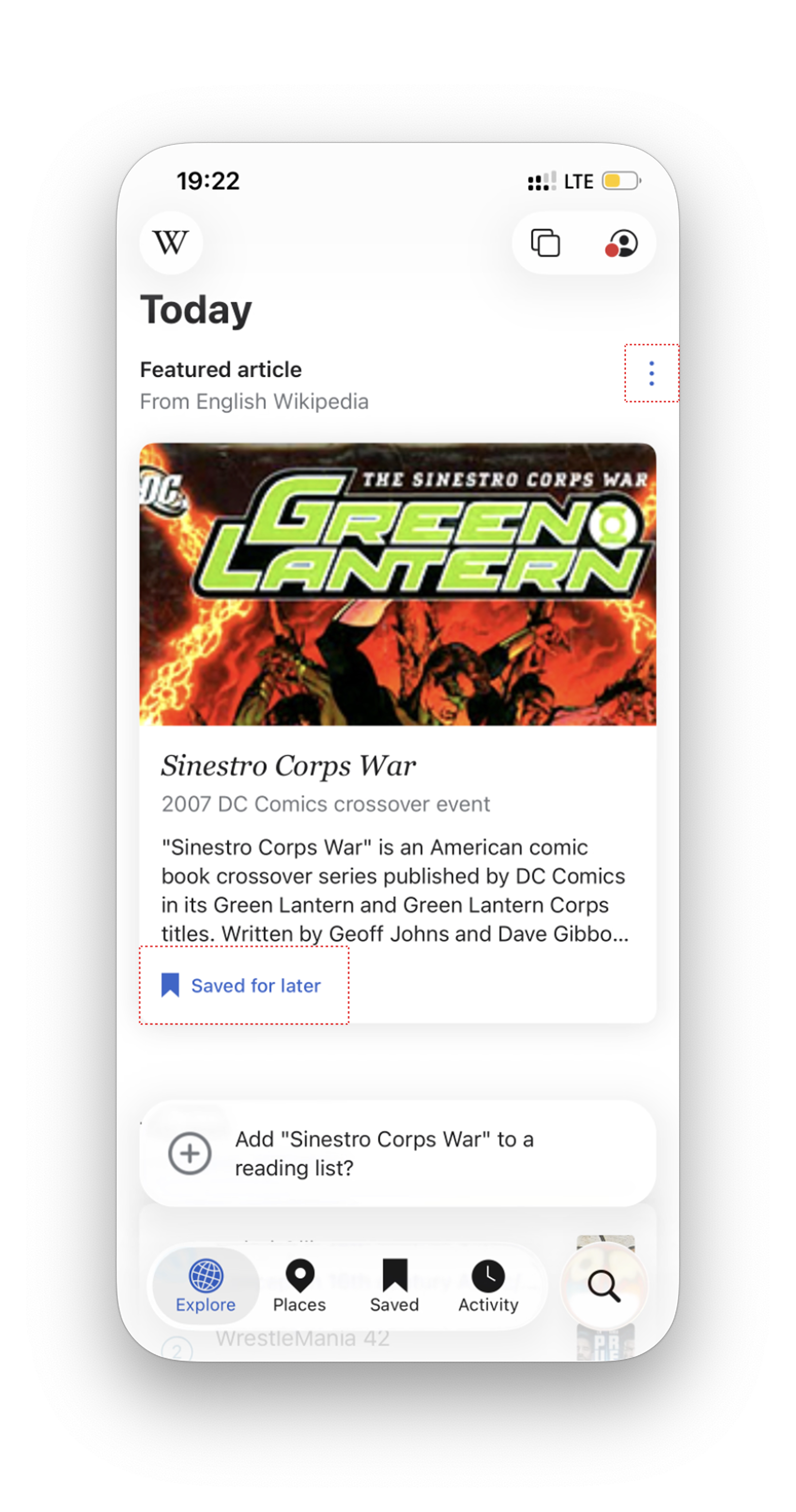
  • Save things she wants to return to without having to find them again
  • Follow links and references without losing track of where she came from
  • Trust that text size and contrast will hold steady as she moves through an app

Pain Points

  • Speak Screen often loses her place after a notification, forcing her to scroll back and find it manually
  • Translucent and layered backgrounds make text harder to read, especially when she's tired
  • VoiceOver navigation is inconsistent across screens, headings aren't always marked up the way she expects
  • Saved or bookmarked items are hard to find later when the interface buries them
Marcus Webb persona portrait

Marcus Webb

Freelance Graphic Designer · Age 29

Motor & Temporary Disabilities

I just want to read something for ten minutes. I shouldn't have to fight my phone to do it.

Goals

  • Browse and discover content without the interface slowing him down
  • Navigate apps comfortably one-handed with limited fine motor control
  • Save things to return to without fumbling through gestures
  • Follow his curiosity from one thing to the next without the interface getting in the way
  • Tap, scroll, and save without needing precision he doesn't have right now

Pain Points

  • Swipe-heavy navigation requires a steadiness he doesn't currently have
  • Translucent and layered elements make it hard to locate and hit interactive targets
  • Losing his place in a feed or triggering the wrong item from an accidental gesture
  • Tap targets too small or too close together, tremor causes frequent mis-taps
  • UI anchored to the top of the screen is hard to reach one-handed
Findings & Recommendations

Where the experience holds up, and where it breaks down.

Each audit is documented as a self-contained block, the headline finding, the specific problems we logged, the recommended fixes, and the WCAG criteria they map to.

Audit Summary

Every WCAG violation, mapped.

Across four audits, we identified a range of WCAG violations. Here’s a snapshot of every criterion flagged, grouped by audit type.

VoiceOver Audit

screen reader & navigation

  • 2.4.3Focus Order
  • 4.1.2Name, Role, Value
  • 4.1.3Status Messages
  • 1.3.1Info & Relationships
  • 2.1.1Keyboard

Visual Audit

contrast & clarity

  • 1.4.3Contrast (Minimum)
  • 1.4.11Non-text Contrast
  • 4.1.2Name, Role, Value

Dynamic Type Audit

text scaling & reflow

  • 1.4.4Resize Text
  • 1.4.10Reflow
  • 1.4.12Text Spacing

Interaction Audit

navigation & orientation

  • 2.4.8Location
  • 2.4.5Multiple Ways

01 / VoiceOver Audit

Elements being skipped by VoiceOver.

Key Finding

VoiceOver navigation on the Explore page skips or mishandles critical interactive elements, leaving screen reader users locked out of core functionality across the discovery experience.

Three-dot menu skipped entirely

Users cannot access important menu actions like Hide this Card, Hide All, or Customize Feed.

See fix

No feedback after Save for later

Users are left uncertain whether the action was successful and cannot confidently proceed with next steps.

See fix

Distance metadata missing

Screen reader users can't tell how far away each place is, making it impossible to choose the closest one.

See fix
VoiceOver audit reference 1VoiceOver audit reference 2

Recommended Fixes

Make elements VoiceOver accessible.

Fix 01

Accessible menu actions

Make the three-dot menu fully focusable and announce its label and role so all menu actions are reachable via VoiceOver.

Fix 02

Status announcement in VoiceOver

Add a status announcement after Save for later and keep focus on the updated element so users can confidently move on.

Fix 03

Include distance value in VoiceOver

Announce the distance value (e.g., 32 meters) for each Places Near card so the spatial context is communicated.

WCAG Violated

WCAG 2.4.3Focus OrderWCAG 4.1.2Name, Role, ValueWCAG 4.1.3Status MessagesWCAG 1.3.1Info and Relationships
Additional VoiceOver Finding

VoiceOver breaks the ‘Places’ tab.

Beyond the Explore page, VoiceOver also breaks down on the Places tab, where the relationship between Map and List views, label announcements, and focus order creates a confusing experience for screen reader users.

Selected tab and results don't match

The 'Map' tab is selected, but the list is displayed. VoiceOver reads 'Map' as selected too, so users get conflicting information about where they are.

See fix

Irrelevant map labels are read out

Sets of labels not available in the regular view are focused here. Changing to new types of labels isn't announced, and the labels aren't ordered well.

See fix

Compass and distance skipped in List view

Key directional and distance information isn't emphasized, and the list order is unclear, making it hard for screen reader users to understand spatial context.

See fix
Places tab VoiceOver issue, screen 1
Places tab VoiceOver issue, screen 2

Recommended Fixes

Make the Places tab VoiceOver-friendly.

Fix 01

Sync tab state with content

Ensure the selected tab (Map/List) matches what's actually displayed, and that VoiceOver announces the correct state. Avoid conflicting signals between visual and audio cues.

Fix 02

Filter and order map labels

Only announce labels relevant to the user's view. When labels change as the user pans or zooms, announce those changes clearly and in a logical order.

Fix 03

Emphasize direction and distance

Make sure compass direction and distance to each place are announced clearly in List view, and that the order matches the visual list. Prioritize spatial context for screen reader users.

WCAG Violated

WCAG 1.3.1Info and RelationshipsWCAG 2.1.1Keyboard (Functional Equivalence)WCAG 2.4.3Focus OrderWCAG 4.1.2Name, Role, Value

02 / Visual Audit

UI elements falling short on accessibility and consistency.

Key Finding

Our visual audit uncovered UI elements across the Explore experience that fall short on accessibility and consistency, from low-contrast buttons to unreadable text over images, making the interface harder to use for low-vision users.

Sort menu lacks clarity

The two options look nearly identical in weight and styling, making it hard for users to quickly identify which sort is active.

See fix

Low contrast on Clear button

The contrast is too subtle, leaving the button's purpose difficult for users to understand its current state.

See fix

Picture of the Day caption

Depending on the image's brightness, the caption text can become nearly unreadable, especially for low-vision users.

See fix
Before
Visual audit before

Recommended Fixes

Enhanced visual experience.

Fix 01

Strengthen the selected state

Use a bolder visual treatment for the active sort option, like heavier font weight, a filled background, or radio-button-style indicators.

Fix 02

Ensure the Clear CTA is distinct

Increase the contrast of the CTA text to meet WCAG AA standards, so it reads clearly as an active, tappable button.

Fix 03

Guarantee readable contrast

Apply a consistent semi-transparent dark gradient or solid overlay behind the caption text, on any image.

WCAG Violated

WCAG 1.4.3Contrast (Minimum)WCAG 1.4.11Non-text ContrastWCAG 4.1.2Name, Role, Value

03 / Dynamic Text Audit

Dynamic text leading to layout issues.

Key Finding

When tested at Dynamic Type size 6, the app’s UI fails to scale gracefully. Text overlaps with other elements, content gets cut off, and layouts break down, locking out users who rely on larger text for readability.

Text overlaps with elements

On the Places page, text collides with adjacent UI elements when scaled up, creating visual clutter.

See fix

Content gets cut off

At Dynamic Type size 6, important content disappears off-screen or behind other elements.

See fix

Layouts don't reflow

Fixed heights and rigid containers prevent content from adapting to larger text sizes, breaking the experience for low-vision users.

See fix
Before
Dynamic type audit before

Recommended Fixes

Flexible and adaptable layout.

Fix 01

Dynamic layout

Use flexible layouts (dynamic spacing, wrapping text, responsive containers) so content reflows cleanly at any text size, without any overlap.

Fix 02

Test at the largest sizes

Test all key screens at the largest accessibility text sizes (up to Dynamic Type size 12) to ensure no content is hidden or cut off.

Fix 03

Allow vertical expansion

Let list items, cards, and tab bars expand vertically as text scales, rather than forcing fixed heights that break the layout.

WCAG Violated

WCAG 1.4.4Resize TextWCAG 1.4.10ReflowWCAG 1.4.12Text Spacing

04 / Interaction Audit

Overwhelming inter-day navigation.

Key Finding

The Explore feed is organized around daily recommendations, with new content stacked on top each time users return. Over time, these daily sections become one long, continuous feed, making it hard to orient, return, or resume where users left off.

Loss of orientation

No separation between days

Makes it hard for users to orient themselves within the feed when daily content blurs into one continuous stream.

See fix

Loss of continuity

No way to resume where you left off

Users who leave the app and come back later often have difficulty returning to where they were last reading.

See fix

Navigation fatigue

No shortcut to past content

Reaching a specific day means scrolling through everything above it first, creating unnecessary friction.

See fix

Recommended Fixes

Easy inter-day navigation.

Fix 01

Day timeline side panel

A timeline side panel that lets users jump directly to any past day, so they don't lose their place after being interrupted.

Fix 02

Section progress badge

Each day shows a count of unread sections, helping users see what's worth going back to.

Fix 03

“Jump to Today” button

A one-tap shortcut back to current content, reducing the scrolling effort that makes the feed inaccessible.

WCAG Violated

WCAG 2.4.8LocationWCAG 2.4.5Multiple Ways
Impact

What this audit unlocks.

The findings are designed to deliver immediate value, for the Wikimedia team that owns the app, and for the millions of users who reach for it every day.

Wikimedia Foundation logo

For Wikimedia

  • A clear roadmap for adopting iOS 26 without leaving users behind.
  • Every finding mapped to a specific WCAG criterion, giving the team a defensible audit trail.
  • A prioritization framework that turns findings into action: Critical, Important, and Enhancement tiers.
Wikipedia logo

For Wikipedia users

  • VoiceOver fixes unlock parts of the Explore experience currently unreachable to screen reader users.
  • Stronger contrast makes the app legible across lighting conditions and visual abilities.
  • Dynamic Type fixes let users scale up text without breaking the layout.
  • Easier inter-day navigation reduces fatigue and keeps users oriented.

Beyond Wikipedia

Forty-plus findings, in one app, from one platform update. The scale is the point.

This is not a Wikipedia problem. Wikipedia is the most accessibility-committed app we reviewed, and it still inherited regressions across every WCAG principle when iOS 26 shipped. The regressions trace back to the platform, not the app, which means every accessibility-conscious iOS team faces the same pressure, most without an audit to catch it.

Three patterns worth pursuing further

01

Translucency as regression.

Liquid Glass’s core move, layered translucency, is in direct tension with contrast, predictability, and motion sensitivity. The visual findings here aren’t bugs. They’re consequences of one platform-level choice.

02

A quiet tax on mission-driven teams.

Every hour Wikipedia spends recovering from iOS 26 regressions is an hour not spent building new accessibility features.

03

The user-side cost.

The harder question is what disabled users do when an app gets harder to use, the workarounds, the switching, the giving up. That adaptation labor is largely undocumented.

These are open questions. The audit can only point at them.

Limitations

What this audit does not claim.

Naming the boundaries of the study is part of taking its findings seriously.

01

No disabled users were involved directly.

The personas were composite, built from Wikimedia's prior research. The findings reflect WCAG conformance and the audit team's evaluation, not first-person accounts. The next phase would center those.

02

Scope was bounded.

Places, Explore, Saved, Activity, and Search were tested in depth. Editing, account management, and notifications were not.

03

iOS 26 is still settling.

Apple has shipped several updates since launch, so some findings may already be addressed and others may shift.

Reflections

What did I learn?

Accessibility isn't a checklist at the end of a project, it's a lens that shapes every decision from the start.

Accessibility evaluation is research, not a checklist.

Conformance is necessary but not enough. The harder work is understanding which problems matter most, to which users, in which moments, and why.

The audit format hides as much as it shows.

“VoiceOver skips three-dot menu” is accurate and useful. It also leaves out what it actually feels like to be the user who can’t hide a card. Both views are needed.

Platform power shapes accessibility.

Apple’s design choices are accessibility choices, whether they call them that or not. Looking only at the app misses where many problems actually start.

Where this goes next.

Two things would take this further: talking to disabled users directly to learn how they cope when an app gets harder to use, and auditing other apps to see if the same problems show up.

You’ve reached the end, ready for another experience?