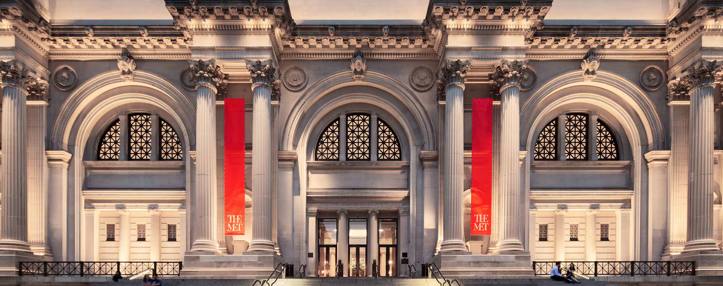
The Met Origins
An interactive 3D globe mapping 6,000+ artifacts from The Metropolitan Museum of Art to their places of origin.
Explore it first. Then read the story behind it.
The Brief
A spatial reading of The Metropolitan Museum of Art’s collection, mapping 6,008 objects to their geographic places of origin and plotted across a five millenia histogram, to make the collection’s shape, its concentrations, absences, and shifts over time, visible at a glance.
A stained glass window at
The Met.
The first time I walked through The Metropolitan Museum of Art, I stopped in front of this stained glass window, it was so beautiful I took a picture of it. Later I learned it was created in Paris around 1245, gifted to the Met in 1924 by George D. Pratt, and had somehow traveled across continents and centuries to end up in Manhattan, New York.
That single object’s journey sparked the question that became this project.
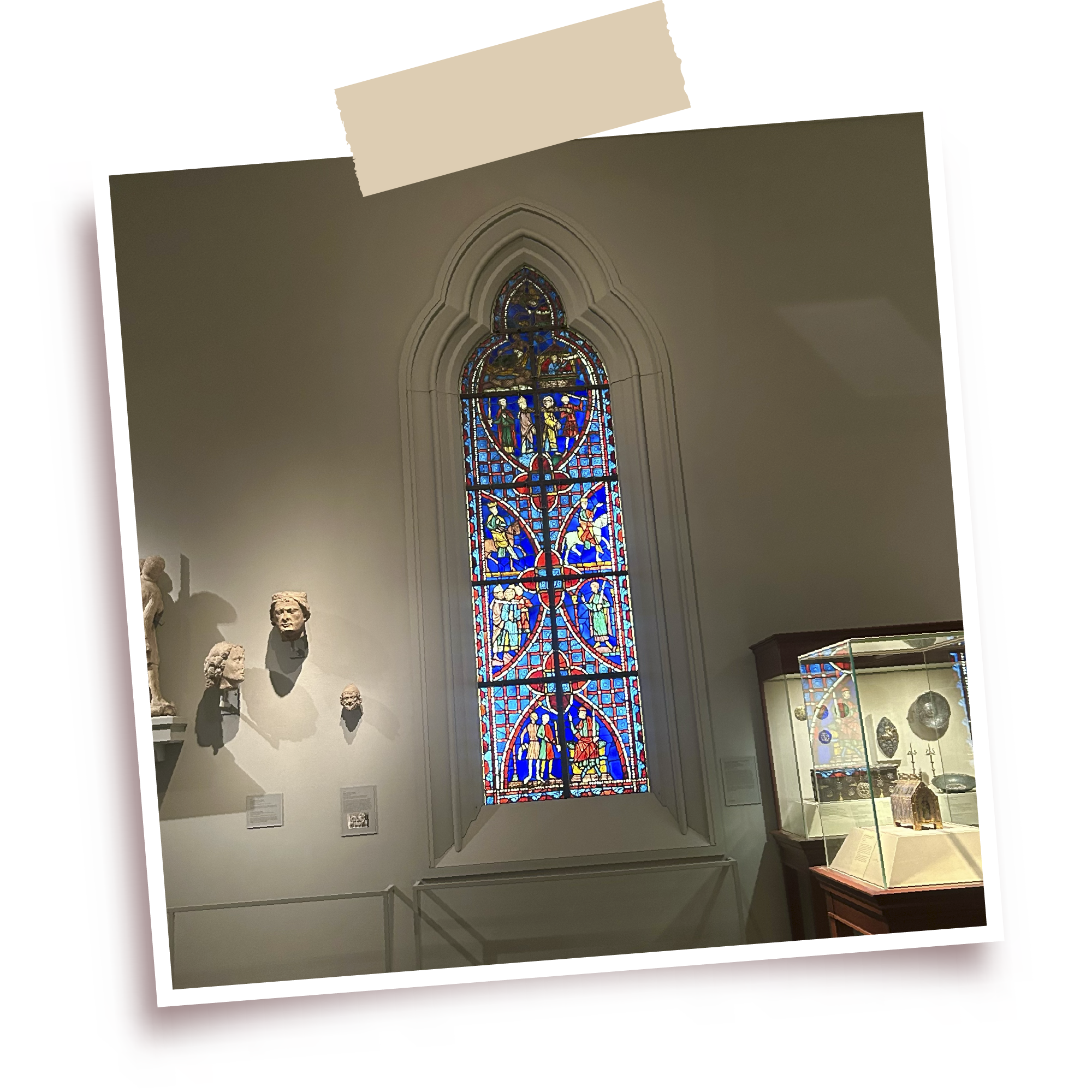
The stained glass window at The Met, Paris c. 1245
View on metmuseum.orgWhere does all of this actually come from?
What journey did each piece take to end up here? The Met holds over 1.5 million works, a collection so vast its geography is almost impossible to grasp standing inside it. This was an attempt to see it differently.
Research Question
What concentrations, absences, and journeys become visible when the objects in a museum collection are mapped by where and when they originated, that gallery-based browsing leaves hidden?
More than the eye can hold.
0
Catalogued artifacts
0
Mapped to coordinates
0.0%
Of the Met collection
0
Documented journeys
The collection already knows where it came from.
The Met catalog holds 450,283 objects. Conventional ways of finding things, by department, medium, or keyword, work well when you already know what you are looking for. They are designed for retrieval. They are not designed for getting an intuitive sense of the collection itself.
Spatial encoding offers a different kind of access. Placing each object on a map turns the collection into something the eye can scan. Patterns that would take hours to derive from a database (where the heaviest concentrations sit, where the gaps are, how the center of gravity shifts across time) become visible at a glance.
Exploration-First
The Met Origins is built as an exploration-first interface. Its purpose is not to help users find a specific object faster but to help them ask better questions of the collection as a whole.
From text fields to a spinning globe.
The data pipeline starts with the Met Open Access API, which exposes 450,283 catalogued objects under a CC0 license. Most records do not include latitude and longitude. They include free-text fields such as Country, Culture, and Artist Nationality. A geocoding pass normalized those strings to country-level centroids and added a small per-record jitter so that artifacts from the same place do not stack into a single point on the globe. Records that could not be resolved were dropped, leaving 6,008 artifacts with usable coordinates. That is roughly 1.3% of the catalog. The remaining 98.7% are not lost; they are still accessible through the Met’s own site, but they are not part of the Met Origins spatial map.
19
Met departments
14
Medium groupings
Dual-handle time slider
The time slider’s track is itself a small information graphic: A custom dual-handle slider spans 3000 BC to 2025 AD, with the track itself rendering a density histogram so users see where the collection clusters in time before filtering.
The time slider exposes a temporal pattern: the center of gravity shifts visibly forward in time, beginning in Mesopotamia and Egypt, then moving through the Mediterranean and into Europe, then dispersing toward modern global concentrations.
Designing for understanding.
Several interaction decisions were aimed at making patterns perceptible rather than just navigable.
Density made visible.
In hex-bin mode, the heatmap surfaces concentration first. Hovering any region shows a tooltip with the dominant origin and the total artifact count for that hex, so quantitative scale is always one cursor-hover away.
Regional detail on click.
Clicking a hex bin replaces the left panel with a Regional Detail view: the full breakdown of origins represented in that region with proportional bars, the top departments, the date range, and a scrollable list of every artifact in the bin.
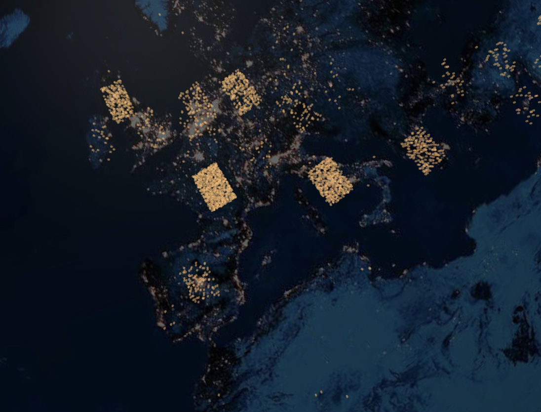
The globe has two view modes. The default is an individual-dot view: each of the 6,008 artifacts is a small amber point.
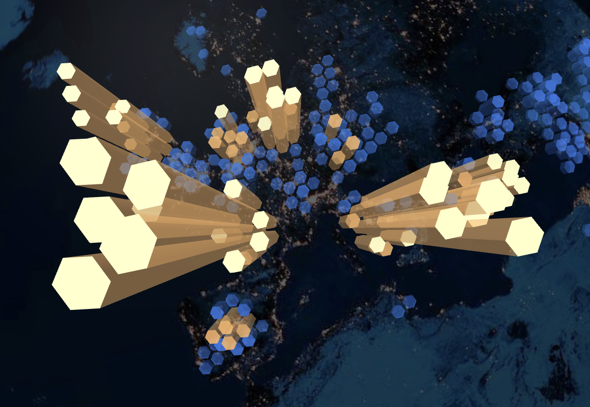
The second is a hex-bin heatmap, in which artifacts within each hexagonal cell are aggregated into a column whose height and color encode density. The color ramp moves from a cool blue at low density, through amber, to a near-white gold at the highest density, so the densest regions of the collection read first.
Mode 01
Amber point mode
Each of the 6,008 artifacts appears as a small amber point at its country centroid, surfacing where the collection sits on the globe.
Mode 02
Hex-bin density mode
Hexagonal cells aggregate artifacts by region; the blue–to–gold ramp encodes density so the heaviest concentrations read first.
Time made explorable.
The time slider runs from 3000 BC to 2025 AD. Its dual handles let users isolate any era, and the histogram-rendered track signals where the data is concentrated before dragging begins.
Journeys made discoverable.
Provenance arcs are drawn from a curated subset of artifacts whose ownership history could be reconstructed into a multi-stop journey where the featured journeys panel surfaces 21 such artifacts.
Patterns the map surfaces.
Spending a few minutes with the visualization surfaces a handful of patterns.
Objects by region
- Western Europe00.0%
- North America00.0%
- Egypt & Ancient Near East00.0%
- Other/Unmapped00.0%
- East Asia00.0%
- South America00.0%
- South Asia00.0%
- Sub-Saharan Africa00.0%
- Southeast Asia00.0%
- Oceania00.0%
- Central Asia00.0%
Western Europe
By far the densest concentration in the mapped data. France, Italy, the Netherlands, and Britain together account for a significant share of the 6,008 plotted artifacts, reflecting both the Met's 19th and 20th-century acquisition history and the relatively complete provenance records for European fine art.
Egypt and the broader ancient Near East
A second concentration sits here, anchored by the Egyptian Art collection. East Asia, particularly Japan and China, forms another visible cluster, much of it from the Asian Art department.
Sparse regions
Sub-Saharan Africa, much of Oceania, large parts of South Asia, and most of pre-Columbian Central and South America all appear lightly represented relative to their cultural production. This is partly a reflection of what is in the catalog and partly an artifact of how thoroughly origin data was recorded for different parts of the collection.
Individual journeys
Provenance arcs make individual stories legible. The Crown of the Virgin of the Immaculate Conception, for instance, travels from Colombia through Chicago, New York, London, and Amsterdam before reaching The Met in New York. These are not narrative claims; they are the documented ownership chains the Met itself publishes.
These patterns are descriptive. They are a record of how the collection was formed (through acquisition, donation, and the history of the global art market) rather than a verdict on what the collection should contain.
My takeaways.
01
Working with incomplete public data shaped the project as much as the design decisions did. Of 450,283 records, only 6,008 (about 1.3 percent) carried enough location signal to plot. The rest are not absent from the visualization by editorial choice but by data quality. Designing around that gap, rather than hiding it, became part of the work.
02
Designing for exploration is a different problem from designing for retrieval. The goal is not to help someone find an object faster but to invite them to look longer. That changes every micro-decision, from interaction tempo (the Take a Tour sequence runs deliberately slowly) to how empty states are handled.
03
Built on The Metropolitan Museum of Art’s open collection data (CC0) and developed with AI-assisted coding using Claude, the project is intended as an independent, attribution-respecting exploration rather than an official Met product.
Roads not yet taken.
Where this could go
The open question is whether spatial, exploration-first browsing actually helps people read a collection more readily than conventional search. Answering it means putting the tool in front of general-audience viewers and watching what they notice, where they linger, and whether they connect with specific objects.
A further direction is comparative: running the same interface across multiple museums’ open data, so the differences in how institutions collected become a subject in their own right.
Try it.
The interactive globe at the top of this page is the live tool. Some patterns only appear when you stop searching and start looking.